 It is tempting to imagine that the nave of Reims Cathedral was originally planned to have a cross-section very similar to that of Soissons Cathedral, with simple blocky buttress uprights whose inner margins would rise directly above the inner margins of the wall shafts below, as shown at left. The lower set of flying buttresses would intersect the clerestory wall right at the springers of the main vault. The choir, seen at right, would have had a similar system, but extended to span the double aisles. The heights of the inner and outer uprights in the choir are used here to set the upper and lower surfaces of the nave uprights, respectively. The overall height of the main vessel is here shown as exactly twice the height of the side aisles, as would be seen in the Reims elevations drawn by Villard de Honnecourt.
Reims- Flying Buttresses
")
")
")
")
Geometrie, Proportion, und Vermessung in der Liebfrauenkirche
") Thank you. It is truly a pleasure to be in Trier once again. I first visited this city nearly 25 years ago, as a student. I was just beginning to learn about German Gothic architecture, but I already knew that the Liebfrauenkirche was “Ein Schlüsselbau der europäischen Gotik.” So, I consider it a great privilege to participate in this conference, and I thank Andreas Tacke, Stefan Heinz and their colleagues for their kind invitation. The title of my talk today is “Geometrie, Proportion, und Vermessung in der Liebfrauenkirche”
Thank you. It is truly a pleasure to be in Trier once again. I first visited this city nearly 25 years ago, as a student. I was just beginning to learn about German Gothic architecture, but I already knew that the Liebfrauenkirche was “Ein Schlüsselbau der europäischen Gotik.” So, I consider it a great privilege to participate in this conference, and I thank Andreas Tacke, Stefan Heinz and their colleagues for their kind invitation. The title of my talk today is “Geometrie, Proportion, und Vermessung in der Liebfrauenkirche”") or, if I can give a subtitle,
or, if I can give a subtitle,") Octagons everywhere. As we will see, geometries based on the octagon control many elements in the design of the Liebfrauenkirche, in its elevation as well as in its remarkable centralized plan.
Octagons everywhere. As we will see, geometries based on the octagon control many elements in the design of the Liebfrauenkirche, in its elevation as well as in its remarkable centralized plan.") Here we see that plan, based on the survey recently completed by Das Büro Leonhardt für Architektur & Denkmalpflege. I am most grateful to Michael Leonhard, to his colleague Kristian Kaffenberger, and to Hans Berthold Busse vom Amt für kirchliche Denkmalpflege for permission to use this new survey data. Before proceeding to analyze the plan of the Liebfrauenkirche in detail, I would like to make a few general observations about geometrical planning in the larger context of the Trier Cathedral complex.
Here we see that plan, based on the survey recently completed by Das Büro Leonhardt für Architektur & Denkmalpflege. I am most grateful to Michael Leonhard, to his colleague Kristian Kaffenberger, and to Hans Berthold Busse vom Amt für kirchliche Denkmalpflege for permission to use this new survey data. Before proceeding to analyze the plan of the Liebfrauenkirche in detail, I would like to make a few general observations about geometrical planning in the larger context of the Trier Cathedral complex.") In this older plan of the complex, you can clearly see the square core of the old cathedral, whose format goes back to late antiquity.
In this older plan of the complex, you can clearly see the square core of the old cathedral, whose format goes back to late antiquity.") Here I have highlighted that part of the structure with a red square.
Here I have highlighted that part of the structure with a red square.") A square of the same size neatly frames the centralized core of the Liebfrauenkirche. It seems plausible to me, therefore, that the thirteenth-century builders of the Liebfrauenkirche may have been influenced by their late antique predecessors, not only in their choice of a centralized church format, but also in their choice of overall scale. It seems to me, moreover, that the old core of the cathedral already incorporates an octagon-based planning strategy that would later be used in the Liebfrauenkirche.
A square of the same size neatly frames the centralized core of the Liebfrauenkirche. It seems plausible to me, therefore, that the thirteenth-century builders of the Liebfrauenkirche may have been influenced by their late antique predecessors, not only in their choice of a centralized church format, but also in their choice of overall scale. It seems to me, moreover, that the old core of the cathedral already incorporates an octagon-based planning strategy that would later be used in the Liebfrauenkirche.") To see this, let us begin by zooming in on that part of the cathedral.
To see this, let us begin by zooming in on that part of the cathedral.") According to my understanding, the sides of the basic square measure 140 Roman feet, each of which measures .296m, so that each side comes to 41.4m. In any case, each side can be called 100%, just by definition.
According to my understanding, the sides of the basic square measure 140 Roman feet, each of which measures .296m, so that each side comes to 41.4m. In any case, each side can be called 100%, just by definition.") If we inscribe an octagon within this square, we can see that its corners align quite closely with the arches that subdivide the square into nine vaulted bays. And, if we inscribe a circle within the square, then we find that the circle intersects the diagonals at 8 points that lie on the interior wall surfaces of the building.
If we inscribe an octagon within this square, we can see that its corners align quite closely with the arches that subdivide the square into nine vaulted bays. And, if we inscribe a circle within the square, then we find that the circle intersects the diagonals at 8 points that lie on the interior wall surfaces of the building.") The walls, which are here shown in yellow, thus frame an interior space that is smaller than the outer square by a factor of 0,924, which is the cosine of the 22.5-degree angle between the main axes and the diagonals of the octagon. I have seen this relationship, which I call octature, in many of the Gothic buildings and drawings that I have studied over the past decade. In recent months, moreover, I have seen that it also helps to set the proportions in the Romanesque abbey at Jumieges, so perhaps I should not have been surprised that it can be found in late antique buildings like the old cathedral of Trier, as well. As I noted, this relationship will also be seen in the Liebfrauenkirche. In seeking to explain the design of the Liebfrauenkirche, however, one must clearly appeal not only to local models, but also to Gothic precedents from France.
The walls, which are here shown in yellow, thus frame an interior space that is smaller than the outer square by a factor of 0,924, which is the cosine of the 22.5-degree angle between the main axes and the diagonals of the octagon. I have seen this relationship, which I call octature, in many of the Gothic buildings and drawings that I have studied over the past decade. In recent months, moreover, I have seen that it also helps to set the proportions in the Romanesque abbey at Jumieges, so perhaps I should not have been surprised that it can be found in late antique buildings like the old cathedral of Trier, as well. As I noted, this relationship will also be seen in the Liebfrauenkirche. In seeking to explain the design of the Liebfrauenkirche, however, one must clearly appeal not only to local models, but also to Gothic precedents from France.") As scholars since the 19th century have recognized, the present plan of the Liebfrauenkirche relates closely to that of St. Yved in Braine, whose east end and diagonally planted chapels you now see at left. As Bruno Klein has demonstrated, though, the two designs actually differ in a number of important respects. The Trier plan incorporates polygonal rather than rounded chapels, for example, and the Trier elevation with its tall arcade owes more to Toul Cathedral than to St. Yved. As I will show presently, moreover, a variety of more subtle factors distinguish the geometrical planning strategies used at Trier from those seen at Braine.
As scholars since the 19th century have recognized, the present plan of the Liebfrauenkirche relates closely to that of St. Yved in Braine, whose east end and diagonally planted chapels you now see at left. As Bruno Klein has demonstrated, though, the two designs actually differ in a number of important respects. The Trier plan incorporates polygonal rather than rounded chapels, for example, and the Trier elevation with its tall arcade owes more to Toul Cathedral than to St. Yved. As I will show presently, moreover, a variety of more subtle factors distinguish the geometrical planning strategies used at Trier from those seen at Braine.") At St. Yved, the crossing bay is a square measuring 10.06 meters per side. Identical red squares adjacent to the crossing do not quite fill the transept arms, since the transept bays together form rectangles that extend slightly further to the north and south.
At St. Yved, the crossing bay is a square measuring 10.06 meters per side. Identical red squares adjacent to the crossing do not quite fill the transept arms, since the transept bays together form rectangles that extend slightly further to the north and south.") However, if one creates an octagon framed by the red squares, one finds that its diagonal facets align perfectly with the diagonal rib along the baseline of the chapels.
However, if one creates an octagon framed by the red squares, one finds that its diagonal facets align perfectly with the diagonal rib along the baseline of the chapels.") Extending these diagonals until they meet the red verticals framing the crossing, moreover, one finds intersection points that define the glass plane in the transept windows, here shown in yellow.
Extending these diagonals until they meet the red verticals framing the crossing, moreover, one finds intersection points that define the glass plane in the transept windows, here shown in yellow.") These extended diagonals then serve as the baselines for the chapels, whose plans are semicircles centered exactly on the baselines. The ribs in the chapels all align at regular multiples of 45 degrees, forming a simple array that links naturally to the vault pattern in the adjacent square bays. The geometrical layout of the Liebfrauenkirche is rather different.
These extended diagonals then serve as the baselines for the chapels, whose plans are semicircles centered exactly on the baselines. The ribs in the chapels all align at regular multiples of 45 degrees, forming a simple array that links naturally to the vault pattern in the adjacent square bays. The geometrical layout of the Liebfrauenkirche is rather different.") First of all, the dimensions of the crossing bay are larger, since its sides measure 10.87meters. Actually, the crossing bay is not quite a perfect square, since its western facet is about 8cm smaller than the other three, but the 10.87 figure seems to have been intended, as I will demonstrate with analyses of the church’s elevation as well as its plan.
First of all, the dimensions of the crossing bay are larger, since its sides measure 10.87meters. Actually, the crossing bay is not quite a perfect square, since its western facet is about 8cm smaller than the other three, but the 10.87 figure seems to have been intended, as I will demonstrate with analyses of the church’s elevation as well as its plan.") It is interesting, at least, that the crossing square of Braine is smaller than that of the Liebfrauenkirche by a factor of 0.924, which is the ratio between the diameter of an octagon and that of the circle circumscribed around it. This octature relationship, which we already saw in the context of the old cathedral, can here be seen in the dotted lines around the Braine crossing. But even if the dimensions of the Liebfrauenkirche were based in this sense on those of St. Yved—and I am not convinced of this—the two designs have strikingly different geometrical systems.
It is interesting, at least, that the crossing square of Braine is smaller than that of the Liebfrauenkirche by a factor of 0.924, which is the ratio between the diameter of an octagon and that of the circle circumscribed around it. This octature relationship, which we already saw in the context of the old cathedral, can here be seen in the dotted lines around the Braine crossing. But even if the dimensions of the Liebfrauenkirche were based in this sense on those of St. Yved—and I am not convinced of this—the two designs have strikingly different geometrical systems.") At Trier, the regular straight bays are exactly half as long as the crossing bay, so that the pairs of bays in each arm fit precisely into red squares like those shown in the crossing, instead of extending beyond them as they do at Braine.
At Trier, the regular straight bays are exactly half as long as the crossing bay, so that the pairs of bays in each arm fit precisely into red squares like those shown in the crossing, instead of extending beyond them as they do at Braine.") At Trier, moreover, the baseline of the chapels is kinked in the middle rather than straight, as the admittedly exaggerated yellow lines at right suggest. The chapels thus rotate subtly outwards from the crossing bay, like pairs of gears that are about to grind up the stairway turrets planted between them.
At Trier, moreover, the baseline of the chapels is kinked in the middle rather than straight, as the admittedly exaggerated yellow lines at right suggest. The chapels thus rotate subtly outwards from the crossing bay, like pairs of gears that are about to grind up the stairway turrets planted between them.") The reason for this, as I will demonstrate more carefully in a few moments, is that the ribs converge to points on the outside of the thick arcade walls, rather than to points on the arcade axes. For related reasons, the buttresses flanking the turrets are pulled in toward them, instead of aligning with the light green axes from the pier centers as they would if the logic of the Braine scheme had been followed. Leaving Braine aside, then, let us consider the proportions of the Liebfrauenkirche in more detail.
The reason for this, as I will demonstrate more carefully in a few moments, is that the ribs converge to points on the outside of the thick arcade walls, rather than to points on the arcade axes. For related reasons, the buttresses flanking the turrets are pulled in toward them, instead of aligning with the light green axes from the pier centers as they would if the logic of the Braine scheme had been followed. Leaving Braine aside, then, let us consider the proportions of the Liebfrauenkirche in more detail.") Here we see the western portion of the church, with its basic armature of square and double-square bays.
Here we see the western portion of the church, with its basic armature of square and double-square bays.") And here we see a set of five circles framed by the main arcade axes. I have drawn these in because the design of the piers and arcade walls seems to have been based on this subdivision.
And here we see a set of five circles framed by the main arcade axes. I have drawn these in because the design of the piers and arcade walls seems to have been based on this subdivision.") To see this, I have here added a sequence of identical circles on the western side of the crossing, this time arranged so that the first and last are concentric with the crossing piers, with four other circles between the piers. As you can see, the crossing piers neatly fill the circles, at least at this level of precision. In fact, they are about 2cm wider than they should be based on a perfect five-fold subdivision of the main vessel.
To see this, I have here added a sequence of identical circles on the western side of the crossing, this time arranged so that the first and last are concentric with the crossing piers, with four other circles between the piers. As you can see, the crossing piers neatly fill the circles, at least at this level of precision. In fact, they are about 2cm wider than they should be based on a perfect five-fold subdivision of the main vessel.") I am willing to overlook this small error, which might even be attributed to thickness in the mortar joints, because the design of the crossing piers is also based on subdivision into fifths. As you can see here, the full diameter of the pier can be found by constructing a sequence of five circles, each equal in diameter to its secondary shafts.
I am willing to overlook this small error, which might even be attributed to thickness in the mortar joints, because the design of the crossing piers is also based on subdivision into fifths. As you can see here, the full diameter of the pier can be found by constructing a sequence of five circles, each equal in diameter to its secondary shafts.") The diameter of the upper torus molding in the pier base equals four shaft diameters.
The diameter of the upper torus molding in the pier base equals four shaft diameters.") The diameter of the pier core itself, meanwhile, equals 3.5 shaft diameters.
The diameter of the pier core itself, meanwhile, equals 3.5 shaft diameters.") The rectangular blocks beneath the shafts are framed by an octagon whose faces are 5.5 shaft diameters apart.
The rectangular blocks beneath the shafts are framed by an octagon whose faces are 5.5 shaft diameters apart.") And the sides of those blocks align with the corner of a smaller octagon, shown here in dark green, that circumscribes the core of the pier.
And the sides of those blocks align with the corner of a smaller octagon, shown here in dark green, that circumscribes the core of the pier.") The outside edges of the plinth, finally, can be found by extending small diagonals from the front faces of these blocks, and from the corners of the larger framing octagon. I find the intersection between modular and geometrical design strategies in this pier design to be intrinsically interesting, and I think that it offers some valuable hints about the larger design strategies at work in the plan of the Liebfrauenkirche.
The outside edges of the plinth, finally, can be found by extending small diagonals from the front faces of these blocks, and from the corners of the larger framing octagon. I find the intersection between modular and geometrical design strategies in this pier design to be intrinsically interesting, and I think that it offers some valuable hints about the larger design strategies at work in the plan of the Liebfrauenkirche.- As I noted a few moments ago, a crucial point about the pier is the way its diameter divides into five shaft diameters, or ten shaft radii.
- So, when we zoom back outwards to consider the plan as a whole, it is not surprising to find that the arcade walls are half as wide as the crossing piers, or one tenth the span between pier axes.
") Here I have indicated those wall thicknesses with yellow shading.
Here I have indicated those wall thicknesses with yellow shading.") And now, we can begin to see why the chapel geometry at Trier is so much more convoluted than at Braine. Here, in light green, I have drawn in diagonal axes like those at Braine, departing from the pier centers.
And now, we can begin to see why the chapel geometry at Trier is so much more convoluted than at Braine. Here, in light green, I have drawn in diagonal axes like those at Braine, departing from the pier centers.") The actual ribs and buttress axes at Trier, which I show here in darker green, are significantly offset from these, because they depart from the edge of the arcade wall rather than from the pier centers.
The actual ribs and buttress axes at Trier, which I show here in darker green, are significantly offset from these, because they depart from the edge of the arcade wall rather than from the pier centers.") The ribs that form the geometrical baseline of the chapel pairs, similarly, are slightly kinked, because their centerpoint is on the main grid of pier centerlines, while their endpoints correspond to the corners of the yellow-shaded rectangle framing the arcade walls. Here I have shown the segments in dark blue, with their endpoints identified as light blue circles. This kinking of the chapel baselines introduces awkward distortions in the placement of the vault keystones, and in the alignment of the ribs that support them.
The ribs that form the geometrical baseline of the chapel pairs, similarly, are slightly kinked, because their centerpoint is on the main grid of pier centerlines, while their endpoints correspond to the corners of the yellow-shaded rectangle framing the arcade walls. Here I have shown the segments in dark blue, with their endpoints identified as light blue circles. This kinking of the chapel baselines introduces awkward distortions in the placement of the vault keystones, and in the alignment of the ribs that support them.") The keystones seem to have been located empirically, about halfway between the lighter and darker green axes that I have drawn. The ribs define vault cells of slightly different widths. The first rib, which appears nearly vertical in my graphic, is offset by some 45 degrees from the chapel baseline. But since the baseline is rotated some 2.5 degrees, the rib and its associated buttress are also slightly offset from the cardinal axis of the church. The second rib is set at an almost perfect diagonal, so that the vault cell between the first and second ribs is pinched down to some 42.5 degrees. The third vault cell spans roughly 45 degrees, while the fourth and final one is wider than the rest, with a span of some 47.5 degrees. These values are not absolutely precise, but the qualitative pattern of distortions is the same in all eight chapels. Since no such distortions occur in the simpler geometry of St. Yved at Braine, this analysis corroborates Klein’s point about the separateness of the workshop traditions that produced the two buildings.
The keystones seem to have been located empirically, about halfway between the lighter and darker green axes that I have drawn. The ribs define vault cells of slightly different widths. The first rib, which appears nearly vertical in my graphic, is offset by some 45 degrees from the chapel baseline. But since the baseline is rotated some 2.5 degrees, the rib and its associated buttress are also slightly offset from the cardinal axis of the church. The second rib is set at an almost perfect diagonal, so that the vault cell between the first and second ribs is pinched down to some 42.5 degrees. The third vault cell spans roughly 45 degrees, while the fourth and final one is wider than the rest, with a span of some 47.5 degrees. These values are not absolutely precise, but the qualitative pattern of distortions is the same in all eight chapels. Since no such distortions occur in the simpler geometry of St. Yved at Braine, this analysis corroborates Klein’s point about the separateness of the workshop traditions that produced the two buildings.") The section of the Liebfrauenkirche is, in my opinion, simpler and more lucid than the plan. Here I show you the interior elevation of the building, based once again on the new survey data that Michael Leonhardt and his colleagues were kind enough to share. Before I introduce any new lines, I want to call your attention to the prominent horizontal shelf where the Obergadenmauer ends.
The section of the Liebfrauenkirche is, in my opinion, simpler and more lucid than the plan. Here I show you the interior elevation of the building, based once again on the new survey data that Michael Leonhardt and his colleagues were kind enough to share. Before I introduce any new lines, I want to call your attention to the prominent horizontal shelf where the Obergadenmauer ends.") I hope you will agree with me that it is logical to consider this level as one of the most important in the elevation, along with the floor level. The axes of the crossing piers, meanwhile, provide important verticals. Together these lines describe the box you see here, whose proportions are quite special.
I hope you will agree with me that it is logical to consider this level as one of the most important in the elevation, along with the floor level. The axes of the crossing piers, meanwhile, provide important verticals. Together these lines describe the box you see here, whose proportions are quite special.") This box fits precisely between the horizontal facets of a regular octagon. The Liebfrauenkirche was by no means the only church to have such proportions.
This box fits precisely between the horizontal facets of a regular octagon. The Liebfrauenkirche was by no means the only church to have such proportions.") The Cistercian church at Altenberg, begun in 1259, follows a very similar scheme, as I discovered while working alongside Norbert Nussbaum.
The Cistercian church at Altenberg, begun in 1259, follows a very similar scheme, as I discovered while working alongside Norbert Nussbaum.") The same octagon-based proportions can also be seen in the Parlerian drawings for the section of the Veitsdom in Prag, and in the masonry of the cathedral itself.
The same octagon-based proportions can also be seen in the Parlerian drawings for the section of the Veitsdom in Prag, and in the masonry of the cathedral itself.") In Trier, the details of the elevation develop naturally within a similar octagonal framework.
In Trier, the details of the elevation develop naturally within a similar octagonal framework.") The equator of the octagon, for example, aligns closely with the centers of the tracery sexfoils in the lower windows. This relationship is not absolutely precise, because the shapes of the window couronnements change slightly depending on the widths of the bays, but I doubt that the alignment was coincidental.
The equator of the octagon, for example, aligns closely with the centers of the tracery sexfoils in the lower windows. This relationship is not absolutely precise, because the shapes of the window couronnements change slightly depending on the widths of the bays, but I doubt that the alignment was coincidental.") And, I feel 100% confident in stating that the arcade capitals were deliberately placed at a height equal to the span of the main vessel, as you can see here. The midpoint of the octagon falls halfway between these capitals and the base of the clerestory.
And, I feel 100% confident in stating that the arcade capitals were deliberately placed at a height equal to the span of the main vessel, as you can see here. The midpoint of the octagon falls halfway between these capitals and the base of the clerestory.") The upper capitals, similarly, were placed at a geometrically fundamental level, although a few intermediate steps are required to see the scheme. First, it is necessary to evenly subdivide the space between the eastern crossing pier and the eastern vertical facet of the octagon, as the dotted yellow construction indicates. Then, one strikes a circle concentric with the large octagon, such that its eastern edge aligns with the dotted vertical. Finally, one strikes a diagonal up from the center of the octagon until it intersects the circle. This intersection point defines the height of the upper capitals.
The upper capitals, similarly, were placed at a geometrically fundamental level, although a few intermediate steps are required to see the scheme. First, it is necessary to evenly subdivide the space between the eastern crossing pier and the eastern vertical facet of the octagon, as the dotted yellow construction indicates. Then, one strikes a circle concentric with the large octagon, such that its eastern edge aligns with the dotted vertical. Finally, one strikes a diagonal up from the center of the octagon until it intersects the circle. This intersection point defines the height of the upper capitals.") The prominent horizontal molding lower on the interior walls and pillars can also be determined by simple geometrical means. If one draws a circle circumscribed by an octagon, with their center on the ground line and their sides frames by the crossing pier axes, then the molding falls at the level where the circle crosses line from the center of the figure to the upper corner of the octagon. The proportions of the Liebfrauenkirche thus involve not only octagons per se, but also the octature relationship that I described at the beginning of my talk in the context of the old cathedral. This principle also helps to set the proportions of the tower at the Liebfrauenkirche, the last component of the building that I will discuss.
The prominent horizontal molding lower on the interior walls and pillars can also be determined by simple geometrical means. If one draws a circle circumscribed by an octagon, with their center on the ground line and their sides frames by the crossing pier axes, then the molding falls at the level where the circle crosses line from the center of the figure to the upper corner of the octagon. The proportions of the Liebfrauenkirche thus involve not only octagons per se, but also the octature relationship that I described at the beginning of my talk in the context of the old cathedral. This principle also helps to set the proportions of the tower at the Liebfrauenkirche, the last component of the building that I will discuss.") The first story of the lantern tower fits neatly into a square, shown here in green, with sides equal in length to the 10.87m span between the axes of the crossing. For reasons that probably involve the difficulty of constructing the tower base, the baseline of the square is shifted about 10cm down and to the west compared to the top facet of the large red octagon, but I strongly suspect that they were meant to coincide perfectly.
The first story of the lantern tower fits neatly into a square, shown here in green, with sides equal in length to the 10.87m span between the axes of the crossing. For reasons that probably involve the difficulty of constructing the tower base, the baseline of the square is shifted about 10cm down and to the west compared to the top facet of the large red octagon, but I strongly suspect that they were meant to coincide perfectly.") The upper margin of the masonry in the tower, shown here as a black horizontal, can be found by striking diagonals inward from the corners of the green square. The capitals in the lantern windows, similarly, can be found by striking diagonals in from the corners and midpoint of the square. If we call the side of the square one unit, therefore, the capitals fall at height one quarter unit, and the masonry terminates at height one and a half units.
The upper margin of the masonry in the tower, shown here as a black horizontal, can be found by striking diagonals inward from the corners of the green square. The capitals in the lantern windows, similarly, can be found by striking diagonals in from the corners and midpoint of the square. If we call the side of the square one unit, therefore, the capitals fall at height one quarter unit, and the masonry terminates at height one and a half units.") The width of the tower can be found by inscribing an octagon in the basic green square, and then constructing a circle around that octagon. Here again, therefore, we see an octature relationship.
The width of the tower can be found by inscribing an octagon in the basic green square, and then constructing a circle around that octagon. Here again, therefore, we see an octature relationship.") The height of the whole tower, finally, can be found by carrying the wall lines upward until they hit the previously defined top edge of the masonry, and then drawing diagonals in until they converge at the tip of the roof, as you see here in violet.
The height of the whole tower, finally, can be found by carrying the wall lines upward until they hit the previously defined top edge of the masonry, and then drawing diagonals in until they converge at the tip of the roof, as you see here in violet. In sum, therefore, I feel that I have developed a reasonably good understanding for the geometrical logic of the Liebfrauenkirche. As one of the first unequivocally Gothic buildings in the German-speaking world, it clearly owes much to French influence, but its centralized plan is highly unusual, and its details distinguish it clearly from one frequently mentioned source, St. Yved in Braine. The Trier ground plan is more convoluted than that of Braine, but the elevation is quite lucid, with both the overall scheme and its details set by interlocking octagons like those seen at Altenberg and Prag. This geometrical investigation, therefore, has enhanced my appreciation of the Liebfrauenkirche, and its pivotal place in the early history of German Gothic design practice. I am grateful for the opportunity to investigate this “Schlüsselbau” with such good data, and I thank all of you for your time and attention.
Neue Erkenntnisse zur Geometrie und Proportion von Liebfrauen
- Vielen Dank. Es ist wirklich eine Freude wieder in Trier zu sein. Ich habe diese Stadt vor nahezu 25 Jahren als Student zum ersten Mal besucht. Ich fing gerade an, über Deutsche Gotische Architektur zu lernen, wusste aber bereits, dass die Liebfrauenkirche “Ein Schlüsselbau der europäischen Gotik” war. Ich empfinde es daher als grosses Privileg, an dieser Tagung teilzunehmen, und ich danke Andreas Tacke, Stefan Heinz, und ihren Kollegen für ihre freundliche Einladung. Der Titel meines heutigen Vortrags lautet “Neue Erkenntnisse zur Geometrie und Proportion von Liebfrauen”…
- oder, wenn ich einen Untertitel geben darf…
- Achtecke überall. Wie wir sehen werden, sind viele Elemente des Entwurfs der Liebfrauenkirche sowohl im Aufriss als auch in ihrem bemerkenswerten zentralisierten Grundriss durch Geometrien bestimmt, die auf Achtecken basieren.
- Diesen Grundriss sehen wir hier, basierend auf der Bauaufnahme die vor Kurzem vom Das Büro Leonhardt für Architektur & Denkmalpflege abgeschlossen wurde. Ich bin Michael Leonhard , seinem Kollegen Kristian Kaffenberger, und Hans Berthold Busse vom Amt für kirchliche Denkmalpflege höchst dankbar für die Erlaubnis, diese neuen Dateien zu nutzen.
- In diesem älteren Grundriss des Komplexes kann man deutlich den quadratischen Kern des alten Doms sehen, deren Format auf die Spätantike zurückgeht.
- Ich habe diesen Teil des Gebäudes hier mit einem roten Quadrat versehen.
- Ein gleichgrosses Quadrat rahmt den zentralisierten Kern der Liebfrauenkirche ziemlich genau ein. Es scheint mir daher plausibel, dass die Erbauer der Liebfrauenkirche im dreizehnten Jahrhundert von ihren spätantiken Vorgängern nicht nur in ihrer Wahl eines zentralisierten Kirchenformats, sondern auch in ihrer Wahl der Gesamtgrösse beeinflusst worden sein könnten. Überdies scheint es mir, dass bereits der alte Kern des Doms eine Entwurfsstrategie einbezieht, die auf Achtecken basiert, so wie sie später in der Liebfrauenkirche verwendet wurde.
- Vergrössern wir nun diesen Teil des Doms, um dies sehen zu können.
- Meinem Verständniss nach betragen die Seiten des Grundquadrats einhundert-vierzig Römisch Fuss, die je 0,296 m entsprechen. Demnach ergibt jede Seite 41,4 Meter. In jedem Fall kann jede Seite per Definition als 100% bezeichnet werden.
- Wenn wir in dieses Quadrat nun ein Achteck einzeichnen, können wir feststellen, dass dessen Ecke ziemlich genau mit den Bögen übereinstimmen, die das Quadrat in neun gewölbte Joche unterteilen. Und wenn wir in das Quadrat einen Kreis einzeichnen, sehen wir, dass der Kreis die Diagonalen an acht auf den Innenwänden des Gebäudes liegenden Punkten schneidet.
- Demnach bilden die hier gelb gezeigten Wände einen Rahmen für einen Innenraum, der um den Faktor 0,924 kleiner ist als das äussere Quadrat. Dies entspricht dem cosinus des 22,5-Grad-Winkel zwischen der Hauptachse und den Diagonalen des Achtecks. Ich habe dieses Verhältnis, die ich Oktatur nenne, in vielen der gotischen Gebäude und Zeichnugen, die ich in den letzten Jahrzehnten studiert habe, gesehen. Überdies habe ich in den vergangenen Monaten auch erkannt, dass es eine wichtige Rolle in den Proportionen der Abteikirche in Jumieges spielt - einem Schlüsselbau der Romanik. Daher sollte es mich veilleicht nicht überraschen, dass es in spätantiken Bauten, wie dem alten Trierer Dom, ebenfalls zu finden ist. Wie bereits angemerkt, wird dieses Verhältnis auch in der Liebfrauenkirche zu sehen sein. Wenn man versucht, den Entwurf der Liebfrauenkirche zu erklären, muss man sich offenbar nicht nur auf lokale Modelle beziehen, sondern auch auf gotische Vorgänger aus Frankreich.
- Wie Gelehrte seit dem neunzehnten Jahrhundert erkannt haben, ist der gegenwärtige Grundriss der Liebfrauenkirche eng mit dem von St. Yved in Braine verbunden, dessen Ostende und diagonal gesetzte Kapellen sie nun links sehen. Wie Bruno Klein jedoch demonstriert hat, unterscheiden sich die zwei Entwürfe in einigen wichtigen Weisen. Der Trier-Entwurf beinhaltet beispielsweise polygonale Kapellen anstatt gerundeten, und der Trier-Aufriss hat mit seinen hohen Arkaden mehr mit der Kathedrale von Toul gemeinsam, als mit St. Yved. Wie ich nun zeigen werde, unterscheiden eine Vielfalt subtiler Faktoren die in Trier verwendeten geometrischen Entwurfsstrategien von denen in Braine.
- Bei St. Yved ist die Vierung ein Quadrat, das auf jeder Seite 10.06 Meter misst. Die identischen, hier rot eingezeichneten Quadrate, die an die Vierung anliegen, füllen die Querschiffarme nicht vollständig aus, da die Querschiffjoche gemeinsam Rechtecke bilden, die etwas weiter nördlich und südlich reichen.
- Wenn man jedoch ein von den roten Quadraten gerahmtes Achteck zeichnet, stellt man fest, dass dessen diagonale Facetten perfekt mit den diagonalen Rippen entlang der Kapellen übereinstimmen.
- Wenn man nun diese Diagonalen verlängert, damit sie die roten Vertikalen treffen, die die Vierung einrahmen, findet man nunmehr Schnittpunkte, die die Fensterebene in den Querschiffsmauern bestimmen, wie hier in gelb markiert.
- Diese verlängerten Diagonalen dienen als die Basislinie für die Kapellen, dessen Grundrisse Halbkreise sind, und die genau auf den Basislinien zentriert sind. Die Rippen der Kapellen stimmen allesamt mit regelmässigen Vielfachen von 45 Grad ueberein, und bilden somit eine einfache Anordnung, die sich auf natürliche Weise an das Gewölbemuster der anliegenden quadtratischen Schiffe anschliesst. Die geometrische Anordnung der Liebfrauenkirche ist eher anders.
- Erstens, sind die Masse des Vierungsquadrats mit einer Seitenlänge von 10.87 Metern grösser. Und in der Tat ist die Vierung kein perfektes Quadrat, da seine westliche Facette um ungefähr 8 cm kürzer ist als die übrigen drei. Die Zahl 10.87 scheint jedoch vorgesehen gewesen zu sein, wie ich mit einer Analyse des Aufrisses und des Grundrisses der Kirche demonstrieren werde.
- Es ist zumindest interessant, dass das Vierungsquadrat von Braine um den Faktor 0,924 kleiner ist als das der Liebfrauenkirche. Dies entspricht dem Grössenverhältnis von dem Durchmesser eines Achtecks und dem eines umschriebenen Kreises. Dieses Oktaturverhältnis, welches wir bereits im Kontext des alten Doms gesehen haben, kann hier in den gestrichelten Linien um die Vierung von Braine verfolgt werden. Aber selbst falls die Dimensionen der Liebfrauenkirche in diesem Sinne auf denen von St. Yved basieren – und ich bin nicht davon überzeugt- besitzen die zwei Entwürfe auffallend verschiehedene geometrische Systeme.
- In Trier sind die gleichmässigen Hauptschiffsjoche genau halb so lang wie das Vierungsjoch, damit die Gewölbepaare in jedem Arm genau in rote Quadrate wie die in der Vierung gezeigten hineinpassen, anstatt über sie hinauszuragen, wie sie es in Braine tun.
- Überdies ist in Trier die Basislinie der Kapellen in der Mitte geknickt anstatt gerade, wie die zugegebenermassen übertriebene gelbe Linie rechts andeutet. Somit drehen sich die Kapellen vom Vierungsjoch aus leicht nach aussen, wie Zahnradpaare, die gleich die zwischen ihnen gepflanzten Treppentürme zermahlen.
- Wie ich in wenigen Momenten sorgfältiger demonstrieren werde, liegt der Grund dafür daran, dass die Rippen an Punkten laufen, die auf der Aussenseite der dicken Arkadenwand liegen, anstatt an Punkten auf der Arkadenachse. Aus ähnlichen Gründen sind die Strebepfeiler, die die Treppentürme flankieren, nach innen gezogen, anstatt mit der hellgrünen Achse der Pfeilermitte übereinzustimmen, wie sie es tun würden, wenn der Logik von Braine gefolgt sein worden wäre.
- Hier sehen wir den westlichen der Kirche mit seinem einfachen Schema von quadtratischen und doppelquadratischen Jochen.
- Und hier sehen wir fünf Kreise, die von der Hauptarkadenachse eingerahmt sind. Ich habe diese eingezeichnet, weil der Entwurf der Pfeiler und Arkadenwände auf dieser Unterteilung basiert worden zu sein scheint.
- Um dies sehen zu können, habe ich hier eine Reihe identischer Kreise auf der westlichen Seite der Vierung hinzugefügt. Diesmal sind sie so angeordnet, dass der erste und der letzte mit den Vierungspfeilern konzentrisch sind und vier weitere Kreise zwischen die Pfeiler fallen. Wie sie sehen können, füllen die Vierungspfeiler die Kreise fast perfekt aus. In der Tat sind sie um zwei Zentimeter breiter als sie es bei einer genauen fünffachen Unterteilung des Hauptschiffs nach sein sollten. Ich bin bereit, diesen kleinen Fehler, der vielleicht sogar dicken Mörtelfugen zuzuschreiben ist, zu übersehen, weil der Entwurf der Vierungspfeiler ebenfalls auf einer Unterteilung in Fünftel basiert.
- Wie sie hier sehen können, kann der Durchmesser des Pfeilers durch die Konstruierung einer Reihe von fünf Kreisen gefunden werden, die im Durchmesser je einem Dienst entsprechen.
- Der Durchmesser des oberen Torus der Pfeilerbasis ergibt vier Dienstdurchmesser.
- Der Durchmesser des Pfeilerkerns selbst ergibt derweil 3,5 Dienstdurchmesser.
- Die rechteckigen Blöcke unterhalb der Dienste sind von einem Achteck eingerahmt, dessen Aussenseiten 5,5 Dienstdurchmesser auseinanderliegen.
- Und die Seiten dieser Blöcke stimmen mit den Eckpunkten eines kleineren, hier in dunkelgrün gezeigten Achtecks überein, welches um den Kern des Pfeilers gezogen ist.
- Die Aussenränder der Plinthe können schliesslich gefunden werden, indem man von den Aussenseiten dieser Blöcke und von den Ecken des grösseren, umrahmenden Achtecks kleine Diagonalen verlängert. Ich finde die Überschneidung von modularen und geometrischen Entwurfsstrategien in diesem Pfeilerentwurf in sich interessant, und ich glaube, dass sie einige wertvolle Hinweise über die grösseren Entwurfsstrategien anbietet, die in dem Entwurf der Liebfrauenkirche am Werk sind.
- Wie ich vor einigen Momenten angemerkt habe, ist ein entscheidender Aspekt des Pfeilerentwurfs die Art und Weise in der sein Durchmesser in fünf Dienstdurchmesser, oder zehn Dienstradii, unterteilt ist.
- Wenn wir also wieder weiter weg zoomen um den Grundriss als ganzes zu betrachten, überrascht es nicht zu erkennen, dass die Arkadenwände halb so breit sind wie die Vierungspfeiler, oder ein zehntel der Spanne zwischen den Pfeilerachsen.
- Hier habe ich die eben genannten Wandtiefen mit gelb schraffiert.
- Und nun können wir anfangen zu erkennen warum die Kapellengeometrie in Trier soviel komplizierter ist, als in Braine. Hier habe ich in hellgrün von den Pfeilermitten ausgehend diagonale Achsen wie in Braine gezeichnet.
- Die tatsächlichen Rippen und Strebepfeilerachsen in Trier, hier in dunkelgrün verdeutlicht, stehen von diesen um einiges ab, weil sie vom Rand der Arkadenwand ausgehen, anstatt von den Pfeilermitten.
- Auf ähnliche Weise sind die Rippen, die die geometrische Basislinie der Kapellenpaare bilden, leicht geknickt, weil ihr Mittelpunkt auf dem Hauptraster der Pfeilermittellinien liegt, während ihre Endpunkte mit den Ecken des gelb-schattierten Rechtecks übereinstimmen, das die Arkadenwände einrahmt. Ich habe die Segmente hier in dunkelblau und ihre Endpunkte mit hellblauen kreisen markiert. Diese Knickung der Kapellenbasislinie leitet unbeholfene Verzerrungen in der Platzierung der Schlusssteine ein, wie auch in der Angleichung der Rippen, die sie stützen.
- Die Schlüsselsteine scheinen auf empirishe Weise ungefähr mittig zwischen der hellgrünen und der dunkelgrün eingezeichneten Achse festgelegt worden zu sein. Die Rippen grenzen Gewölbekappen ab, die in ihrer Breite leicht verschieden sind. Die erste Rippe, die in meiner Grafik nahezu senkrecht zu sein scheint, steht von der Kapellenbasislinie um etwa 45 Grad ab. Da die Basislinie jedoch um ungefähr 2,5 Grad gedreht ist, weichen die Rippe und die mit ihr verbundener Strebepfeiler ebenfalls von der Hauptachse der Kirche ab. Die zweite Rippe verläuft in einer nahezu perfekten Diagonale, damit die Kappe zwischen der ersten und zweiten Rippe auf rund 42,5 Grad gequetscht ist. Die dritte Kappe spannt grob 45 Grad, während die vierte und letzte Kappe mit einer Spanne von 47,5 Grad grösser ist, als die anderen. Diese Werte sind nicht absolut präzise, aber das qualitative Muster von Abweichungen ist in allen acht Kapellen dasgleiche. Da in der einfacheren Geometrie von St. Yved in Braine keine solchen Verzerrungen auftauchen, bekräftigt diese Analyse Kleins These über die Getrenntheit der Werkstatt-Traditionen, aus denen die zwei Bauten hervorgehen.
- Der Aufriss der Liebfrauenkirche ist meiner Meinung nach einfacher und übersichtlicher als der Grundriss. Hier zeige ich ihnen den Aufriss des Innenraums des Baus, basierend auf den neuen Daten, die Michael Leonhardt und seine Kollegen so freundlich waren, zu teilen. Bevor ich hier neue Linien einführe, möchte ich ihre Aufmerksamkeit auf das prominente horizontale Gesims leiten, wo die Obergadenmauer endet.
- Ich hoffe, sie werden mir zustimmen, dass es logisch ist, dieses Gesims zusammen mit der Bodenliene als eine der wichtigsten Horizontalen des Aufrisses zu betrachten. Die Achsen der Vierungspfeiler liefern derweil wichtige Senkrechten. Gemeinsam bilden diese Linien die Box, die sie hier sehen, und dessen Proportionen was ziemlich besonderes sind.
- Diese Box past genau zwischen die horizontalen Facetten eines regelmässigen Achtecks. Die Liebfrauenkirche war keinesfalls die einzige Kirche mit solchen Proportionen.
- Die in 1259 begonnene Zisterzienserkirche von Altenberg folgt einem sehr ähnlichen Schema, wie ich während meiner Zusammenarbeit mit Norbert Nussbaum entdeckte.
- Dieselben auf einem Achteck basierenden Proportionen können auch in der Parlerischen Zeichnung für den Querschnitt des Veitsdom in Prag und im Mauerwerk der Kathedrale selbst beobachtet werden.
- In Trier entwickeln sich die Details des Aufrisses auf natürliche Weise innerhalb des Achteckigen Rahmenwerks.
- Der Äquator des Achtecks deckt sich beispielsweise nahezu mit den Mittelpunkten der Sechspässe in den unteren Fenstern. Dieses Verhältnis ist nicht absolut präzise, weil die Form der Fenstercouronnements sich aufgrund der Breite der Joche leicht verändern, aber ich bezweifle das die Fluchtung ein Zufall ist.
- Weiter bin ich mir 100% sicher, dass die Arkadenkapitelle absichtlich in einer Höhe gleich der Breite des Hauptschiffs platziert wurden, wie sie hier sehen können. Der Mittelpunkt des Achtecks fällt halbwegs zwischen diese Kapitelle und die Basislinie des Obergaden.
- Ähnlicherweise sind die oberen Kapitelle auf einer geometrisch grundliegenden Ebene platziert worden, wobei einige Zwischenstufen erforderlich sind, um das Schema zu erkennen. Erstens ist es notwendig den Bereich zwischen dem östlichen Vierungspfeiler und der östlichen senkrechten Facette des Achtecks in zwei zu unterteilen, wie die gelb gestrichelte Konstruktion andeutet. Dann schlägt man einen mit dem grossen Achteck konzentrischen Kreis, damit dessen östliche Kante mit der gestrichelten Vertikalen übereinstimmt. Schliesslich zieht man von dem Zentrum des Achtecks aus eine Diagonale aufwärts bis zum Kreis. Dieser Kreuzungspunkt legt die Höhe der oberen Kapitelle fest.
- Das prominente waagerechte Gesimse, das weiter unten auf den Innenwänden und Säulen läuft, kann ebenfalls durch einfache geometrische Mittel ermittelt werden. Wenn man einen mit einem Achteck umschriebenen Kreis zeichnet, damit deren Mittelpunkte auf der Basislinie liegen und ihre Seiten von den Vierungspfeilerachsen gerahmt sind, dann fällt das Gesimse auf die Ebene, wo der Kreis die Linie kreuzt, die vom Zentrum der Figur zur oberen Ecke des Achtecks verläuft. Die Proportionen der Liebfrauenkirche beinhalten daher nicht alleine Achtecke in sich, sondern ebenfalls das Oktatur-Verhältnis, welches ich am Anfang meines Vortrags in Bezug auf den alten Dom beschrieben habe. Dieses Prinzip hilft auch dabei, die Proportionen des Turms der Liebfrauenkirche zu bestimmen. Dieser ist die letzte Komponente des Baus, den ich heute besprechen werde.
- Das erste Geschoss des Lantern-Turms past ordentlich in ein hier grün gezeigtes Quadrat hinein, dessen Seitenlänge mit der 10.87m Spanne zwischen den Achsen der Vierung übereinstimmt. Aus Gründen, die wahrscheinlich die mit der Konstruktion der Turmbasis verbundenen Schwierigkeiten einschliessen, ist die Basislinie des Quadrats im Vergleich zur obersten Facette des grossen roten Achtecks um ungefähr 10 cm nach unten und nach Westen verschoben, aber ich habe einen starken Verdacht, dass sie zu einer vollkommenen Übereinstimmung gedacht waren.
- Der hier als schwarze Horizontale dargestellte obere Rand des Mauerwerks im Turm kann gefunden werden, indem man von den Ecken des grünen Quadrats aus Diagonale nach innen zieht. Ähnlicherweise können die Kapitelle in den Turmfenstern durch Diagonale bestimmt werden, die von den Eckpunkten und Mittelpunkt des Quadrats aus verlaufen. Wenn wir also die Seitenlänge des Quadrats als eine Einheit bezeichnen, befinden sich die Kapitelle in einer Höhe von ein-viertel Einheit, und endet das Mauerwerk in einer Höhe von eineinhalb Einheiten.
- Die Breite des Turms kann dadurch gefunden werden, dass man in das grüne Quadrat ein Achteck einzeichnet, und um dieses einen Kreis zieht. Somit sehen wir hier wieder ein Oktaturverhältnis.
- Die Höhe des gesamten Turms kann schliesslich bestimmt werden, indem man die Wandlinien nach oben hin bis zum zuvor bestimmten Oberrand des Mauerwerks verlängert und anschliessend Diagonale einzeichnet bis sie an der Dachspitze zusammenlaufen, wie sie hier in Violett sehen.
- Im Ganzen habe ich das Gefühl ein ziemlich gutes Verständnis für die geometrische Logik der Liebfrauenkirche entwickelt zu haben. Als eine der ersten eindeutig gotischen Bauten im deutsch-sprachigen Raum gebührt sie vieles an Einflüsse aus Frankreich, ihr zentralisierter Grundriss jedoch ist höchst ungewöhnlich, und ihre Details unterscheiden sie klar von dem oft genannten Prototyp, St. Yved in Braine. Der Trierer Grundriss ist verschlungener als der von Braine, aber der Aufriss ist recht übersichtlich in der Art wie das allgemeine Schema und seine Details durch verschlossene Achtecke gesetzt sind, so wie die in Altenberg und Prag. Diese geomtrische Untersuchung hat daher meine Einschätzung für die Liebfrauenkirche und ihren zentralen Rolle in der frühen Geschichte der Entwurfspraktiken in der Deutschen Gotik gesteigert. Ich bin dankbar für die Gelegenheit diesen Schlüsselbau mit solch guten Daten erforschen zu können, und ich danken Ihnen für Ihre Zeit und Ihre Aufmerksamkeit.
The Geometrical Roots of Gothic Design and Aesthetics: The Case of the Cologne Cathedral Choir
A Geometrical Analysis of the Gothic Choir at Aachen Cathedral
Author: Robert Bork
A Geometrical Analysis of the Gothic Choir at Aachen Cathedral
A Geometrical Investigation of the Cistercian Church at Altenberg
Author: Robert Bork
A Geometrical Investigation of the Cistercian Church at Altenberg
The Linked Geometries of Reims Cathedral’s Nave Section and West Façade
Author: Robert Bork
The Linked Geometries of Reims Cathedral’s Nave Section and West Façade
The Renaissance Myth of Gothic License
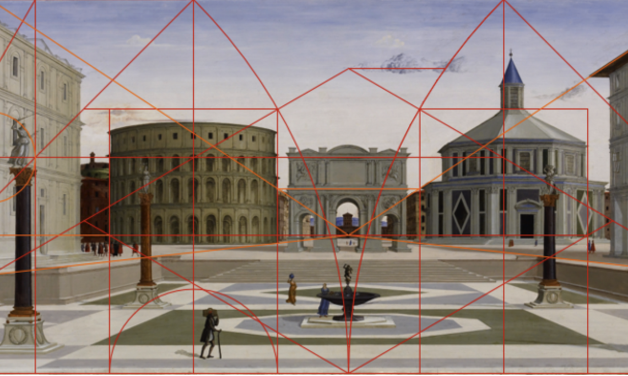
 Today I will critique the idea, popularized in the Renaissance, that Gothic buildings like Strasbourg Cathedral, seen at left, are chaotic and disorderly and that architectural harmony depends on the use of the classical orders, seen at right as shown by Serlio. Mine might seem like an unnecessary project, since the Gothic tradition has had many champions in the intervening centuries, but it’s my sense that this myth of Gothic disorderliness continues to shape the writing of art history even today, contributing among other things to the vexed position of architecture in discussions of the Northern Renaissance. Although I am speaking in broad terms about the Gothic and Renaissance design traditions, I recognize the fuzziness and permeability of such categories. I use these terms not only because I find them genuinely helpful in trying to grapple with the complex patterns of European architectural production, but also because this basic framing has figured so prominently in the historiography of the period. For sake of clarity, I will briefly outline my theses before going on to consider that historiography and its consequences.
") First, I will argue that the Renaissance dismissal of Gothic architectural order was meant both to encourage and to naturalize the demise this non-classical mode.
First, I will argue that the Renaissance dismissal of Gothic architectural order was meant both to encourage and to naturalize the demise this non-classical mode.") Second, I will show that this dismissal was unfair, drawing on some of my own recent geometrical research to demonstrate the procedural logic of Gothic design.
Second, I will show that this dismissal was unfair, drawing on some of my own recent geometrical research to demonstrate the procedural logic of Gothic design.") Third, I will argue on this basis that the transition between Gothic and Renaissance design seen across Europe in the sixteenth century had less to do with the taste for order than it did with the taste for Roman-style glory, and what Tom Dandelet has recently called “The Renaissance of Empire.”
Third, I will argue on this basis that the transition between Gothic and Renaissance design seen across Europe in the sixteenth century had less to do with the taste for order than it did with the taste for Roman-style glory, and what Tom Dandelet has recently called “The Renaissance of Empire.”") Finally, I will suggest that considerations of local and national pride have played some role in obscuring the dynamics of this broad phenomenon.
Finally, I will suggest that considerations of local and national pride have played some role in obscuring the dynamics of this broad phenomenon.") The idea of an opposition between Gothic and Renaissance modes appears already in the middle of the fifteenth century, as when Filarete urged his patron Francesco Sforza to abandon what he called the modo moderno and embrace the modo antico. For Filarete, who was then working in Milan, a conspicuous example of the former mode was the cathedral of Milan.
The idea of an opposition between Gothic and Renaissance modes appears already in the middle of the fifteenth century, as when Filarete urged his patron Francesco Sforza to abandon what he called the modo moderno and embrace the modo antico. For Filarete, who was then working in Milan, a conspicuous example of the former mode was the cathedral of Milan.") As Berthold Hub has observed, Filarete’s own designs for structures such as the proposed tower of Sforzinda, at right, are not conventionally classical, and they suggest reference to an antiquity more generalized than that of the Roman Empire alone, but Filarete nevertheless insisted in his text on the superiority of antique models over the supposedly barbaric modern mode that we now call Gothic.
As Berthold Hub has observed, Filarete’s own designs for structures such as the proposed tower of Sforzinda, at right, are not conventionally classical, and they suggest reference to an antiquity more generalized than that of the Roman Empire alone, but Filarete nevertheless insisted in his text on the superiority of antique models over the supposedly barbaric modern mode that we now call Gothic.") As a counterpoint of sorts to this attitude, Cesariano half a century later used a modified cross section of Milan cathedral as an exemplar of geometrical order in his 1521 edition of Vitruvius.
As a counterpoint of sorts to this attitude, Cesariano half a century later used a modified cross section of Milan cathedral as an exemplar of geometrical order in his 1521 edition of Vitruvius.") His other illustrations, though, contributed to spreading knowledge of classical architecture, and of the orders in particular.
His other illustrations, though, contributed to spreading knowledge of classical architecture, and of the orders in particular.") The publication of Serlio’s Libri starting in 1537 contributed even more strongly to this phenomenon, so that the formerly “modern” Gothic style began to seem old-fashioned.
The publication of Serlio’s Libri starting in 1537 contributed even more strongly to this phenomenon, so that the formerly “modern” Gothic style began to seem old-fashioned. Vasari, in the introduction to his Vite, famously criticized what he called the “maniera tedesca” as monstrous, barbarous, and disorderly, or, to use the words quoted in my talk title, “dimenticando ogni lor cosa di ordine.” As Annemarie Sankovitch observed, Vasari’s “maniera tedesca” cannot be directly equated with what we now call the Gothic style, in part because its definition seems to evolve even between the 1550 and 1568 editions of the Vite. In broad terms, however, Vasari was critiquing medieval buildings including Milan cathedral.
") At times, he seems to have had in mind structures like the façade of Orvieto cathedral, since he laments the use of twisted columns, slender shafts and tall gables that seem thin and insubstantial, like paper. Although Vasari condemns the maniera tedesca as disorderly, he at least engages with architecture, as he basically had to given the importance of builders like Brunelleschi and Bramante in the larger narrative of artistic rebirth that he was aiming to construct.
At times, he seems to have had in mind structures like the façade of Orvieto cathedral, since he laments the use of twisted columns, slender shafts and tall gables that seem thin and insubstantial, like paper. Although Vasari condemns the maniera tedesca as disorderly, he at least engages with architecture, as he basically had to given the importance of builders like Brunelleschi and Bramante in the larger narrative of artistic rebirth that he was aiming to construct.") North of the Alps, however, authors such as Domenicus Lampsonius were beginning to construct a canon of northern painters who could be celebrated for their realism, while leaving architecture entirely out of the picture.
North of the Alps, however, authors such as Domenicus Lampsonius were beginning to construct a canon of northern painters who could be celebrated for their realism, while leaving architecture entirely out of the picture.") Karel Van Mander took the same basic approach in his Schilderboek, published in 1604, even though he cast his geographical, chronological, and thematic net far more widely, discussing northern painters and printmakers alongside their Italian colleagues and ancient predecessors.
Karel Van Mander took the same basic approach in his Schilderboek, published in 1604, even though he cast his geographical, chronological, and thematic net far more widely, discussing northern painters and printmakers alongside their Italian colleagues and ancient predecessors.") In this way Van Mander passed over the awkward fact that heroic fifteenth-century figures like Jan van Eyck lived in an architectural environment that remained Gothic. This approach still dominates discussion of the so-called Northern Renaissance, leaving the history of late Gothic architecture lamentably understudied by comparison.
In this way Van Mander passed over the awkward fact that heroic fifteenth-century figures like Jan van Eyck lived in an architectural environment that remained Gothic. This approach still dominates discussion of the so-called Northern Renaissance, leaving the history of late Gothic architecture lamentably understudied by comparison.") In the meanwhile, Gothic architecture received plenty of praise, but even the favorable attention often associated these buildings with the dark, mysterious, and spiritual, in contrast to the lucid rationality of the classical tradition, broadly construed, as this painting by Thomas Cole reminds us.
In the meanwhile, Gothic architecture received plenty of praise, but even the favorable attention often associated these buildings with the dark, mysterious, and spiritual, in contrast to the lucid rationality of the classical tradition, broadly construed, as this painting by Thomas Cole reminds us.") In the nineteenth century, of course, scholars such as Viollet-le-Duc celebrated Gothic architecture for its structural and geometrical rationalism. Viollet’s cross-section of Bourges Cathedral at right, however, was inaccurate, and it does little justice to the design’s elegance, as I will show in few minutes.
In the nineteenth century, of course, scholars such as Viollet-le-Duc celebrated Gothic architecture for its structural and geometrical rationalism. Viollet’s cross-section of Bourges Cathedral at right, however, was inaccurate, and it does little justice to the design’s elegance, as I will show in few minutes.") Like many of his countrymen, Viollet-le-Duc prioritized the earlier phases of Gothic over the later ones. He dismissed the Strasbourg spire for its supposedly disgraceful silhouette, for example, preferring the simpler forms of the twelfth and thirteenth centuries. Despite his advocacy of Gothic, therefore, Viollet-le-Duc helped to spread the idea that the Gothic architectural tradition became decadent. It’s that stubbornly persistent idea that I’m now seeking to challenge, while swimming against some powerful historiographical currents.
Like many of his countrymen, Viollet-le-Duc prioritized the earlier phases of Gothic over the later ones. He dismissed the Strasbourg spire for its supposedly disgraceful silhouette, for example, preferring the simpler forms of the twelfth and thirteenth centuries. Despite his advocacy of Gothic, therefore, Viollet-le-Duc helped to spread the idea that the Gothic architectural tradition became decadent. It’s that stubbornly persistent idea that I’m now seeking to challenge, while swimming against some powerful historiographical currents.") The whole of late medieval civilization, for instance, has been widely seen as waning ever since the publication of Johan Huizinga’s “Autumn of the Middle Ages” in 1919.
The whole of late medieval civilization, for instance, has been widely seen as waning ever since the publication of Johan Huizinga’s “Autumn of the Middle Ages” in 1919.") Huizinga was more concerned with fifteenth-century painting and literature than with architecture, but his arguments have colored many scholarly perceptions of the period.
Huizinga was more concerned with fifteenth-century painting and literature than with architecture, but his arguments have colored many scholarly perceptions of the period. Henri Focillon, for example, described late Gothic architecture as a phase of decline and decrepitude, comparable to the senescence of an individual. This approach naturalizes the demise of the Gothic tradition in a way that I see as profoundly misleading.
") Meanwhile, many twentieth-century authors discussing figural art of the corresponding years invoked the same basic Northern Renaissance framing pioneered by Lampsonius and Van Mander, as was the case with Max Friedländer.
Meanwhile, many twentieth-century authors discussing figural art of the corresponding years invoked the same basic Northern Renaissance framing pioneered by Lampsonius and Van Mander, as was the case with Max Friedländer.") In a similar vein, Erwin Panofsky treated van Eyck within the frame of “Early Netherlandish Painting,” thus rescuing him from the sinking ship of late medievalism.
In a similar vein, Erwin Panofsky treated van Eyck within the frame of “Early Netherlandish Painting,” thus rescuing him from the sinking ship of late medievalism.") This emphasis on a conveniently architecture-free Northern Renaissance remains influential even today, especially in the English-speaking world, thanks to the popularity of textbooks like Snyder’s.
This emphasis on a conveniently architecture-free Northern Renaissance remains influential even today, especially in the English-speaking world, thanks to the popularity of textbooks like Snyder’s.") This framing obscures the distinction between realistic art made by artists like van Eyck who still lived in a Gothic world, and those like Jan Gossaert, who helped to promote the rise of classical design. The dynamics of the Gothic-to-Renaissance transition thus remain surprisingly understudied, even though the distinction between these two modes has often been remarked.
This framing obscures the distinction between realistic art made by artists like van Eyck who still lived in a Gothic world, and those like Jan Gossaert, who helped to promote the rise of classical design. The dynamics of the Gothic-to-Renaissance transition thus remain surprisingly understudied, even though the distinction between these two modes has often been remarked.") This distinction was underscored by two widely cited publications from 1949. James Ackerman’s article “Ars sine scientia nihil est” revealed a rather chaotic ad hoc planning process at the cathedral of Milan around 1400, while Rudolph Wittkower’s book “Architectural Principles in the Age of Humanism” argued that Renaissance structures such as Alberti’s façade for Santa Maria Novella in Florence were governed by rigorous proportional relationships comparable to the harmonies of music. Taken at face value, these results make Gothic architecture appear chaotic and unsophisticated compared to that of the emergent Renaissance. In fact, however, the evidence for proportional harmonies in Renaissance design is weaker than Wittkower proposed, and the geometrical rigor of Gothic design was often far greater than most scholars have assumed, as I will now briefly show.
This distinction was underscored by two widely cited publications from 1949. James Ackerman’s article “Ars sine scientia nihil est” revealed a rather chaotic ad hoc planning process at the cathedral of Milan around 1400, while Rudolph Wittkower’s book “Architectural Principles in the Age of Humanism” argued that Renaissance structures such as Alberti’s façade for Santa Maria Novella in Florence were governed by rigorous proportional relationships comparable to the harmonies of music. Taken at face value, these results make Gothic architecture appear chaotic and unsophisticated compared to that of the emergent Renaissance. In fact, however, the evidence for proportional harmonies in Renaissance design is weaker than Wittkower proposed, and the geometrical rigor of Gothic design was often far greater than most scholars have assumed, as I will now briefly show.") At left, for instance, is a schematic plan of Reims Cathedral, designed soon after 1200, based on a laser survey that I undertook this past summer with my graduate student Rebecca Smith. Building on work by Nancy Wu, Rebecca and I have been able to demonstrate that the whole plan evolves from a series of geometrical steps based on the unfolding of polygons, starting with the decagonal symmetry of the east end, and extending to the square-based forms of the transept and crossing, as seen at right. Gothic designers often created interlocking systems of polygons in elevation, as well.
At left, for instance, is a schematic plan of Reims Cathedral, designed soon after 1200, based on a laser survey that I undertook this past summer with my graduate student Rebecca Smith. Building on work by Nancy Wu, Rebecca and I have been able to demonstrate that the whole plan evolves from a series of geometrical steps based on the unfolding of polygons, starting with the decagonal symmetry of the east end, and extending to the square-based forms of the transept and crossing, as seen at right. Gothic designers often created interlocking systems of polygons in elevation, as well.") Here, for instance, is a laser-scanned section of Bourges Cathedral made by Andrew Tallon.
Here, for instance, is a laser-scanned section of Bourges Cathedral made by Andrew Tallon.") And here is my analysis of its geometry. As you can see, the total height to the roofline is set by a great square framing the buttresses, while the height to the pinnacle tips is given by an equilateral triangle sharing the square’s baseline. The smaller yellow equilateral triangle whose baseline matches the width between the glass planes in the aisles gives the interior height of the vaults. There are obviously many more details in these schemes that I don’t have time to unpack in today’s short presentation, but I hope the general picture comes through clearly.
And here is my analysis of its geometry. As you can see, the total height to the roofline is set by a great square framing the buttresses, while the height to the pinnacle tips is given by an equilateral triangle sharing the square’s baseline. The smaller yellow equilateral triangle whose baseline matches the width between the glass planes in the aisles gives the interior height of the vaults. There are obviously many more details in these schemes that I don’t have time to unpack in today’s short presentation, but I hope the general picture comes through clearly.") Vasari would not have known Reims or Bourges, but some of the same design principles seen at those French buildings also govern the façade at Orvieto.
Vasari would not have known Reims or Bourges, but some of the same design principles seen at those French buildings also govern the façade at Orvieto. The height to the center of the rose, for instance, is set by an equilateral triangle sharing its baseline with a square framing the façade composition. The top of the triforium aligns with the corners of an octagon inscribed within that square.
") A second equilateral triangle based on the corners of a smaller octagon gives the profile of the upper gable.
A second equilateral triangle based on the corners of a smaller octagon gives the profile of the upper gable.") The current facade represents a refinement of design themes introduced in two surviving drawings, of which I now show one at right. The analysis of such drawings can give an intimate perspective on the Gothic design process.
The current facade represents a refinement of design themes introduced in two surviving drawings, of which I now show one at right. The analysis of such drawings can give an intimate perspective on the Gothic design process.") As a final case, I here show you an overall view and a detail of a remarkable 4-meter high drawing that has only recently come to scholarly attention. Costanza Beltrami has convincingly argued that this is the drawing for the crossing spire of Rouen cathedral, presented by designer Roland le Roux in 1516.
As a final case, I here show you an overall view and a detail of a remarkable 4-meter high drawing that has only recently come to scholarly attention. Costanza Beltrami has convincingly argued that this is the drawing for the crossing spire of Rouen cathedral, presented by designer Roland le Roux in 1516.") Although the drawing incorporates pseudo-perspectival depth cues, I found that its proportions derive from a rigorously constructed geometrical armature just like those used for earlier Gothic drawings that present strictly orthogonal views.
Although the drawing incorporates pseudo-perspectival depth cues, I found that its proportions derive from a rigorously constructed geometrical armature just like those used for earlier Gothic drawings that present strictly orthogonal views.") Despite its high degree of geometrical and formal order, the Rouen drawing does not have the clear and lucid appearance of Brunelleschi’s San Lorenzo in Florence, designed nearly a century earlier. This distinction has doubtless contributed to the historiographical trend that I discussed earlier, which I described in my title as the myth of Gothic license. As I have tried to briefly show, Gothic design was, in fact, no more wayward than classical design. In technical terms, moreover, guild-trained Gothic builders were at least as competent as most of the goldsmiths, sculptors, and painters who began to get building commissions in the Renaissance, although I recognize Brunelleschi as an exception to that rule. Since Renaissance buildings were neither more orderly nor more robust than Gothic buildings, the diffusion of antique design must have been motivated by other factors. Of these, I see political symbolism as by far the most important. Although the Renaissance manner first emerged in Republican Florence, its spread was tied up more with imperial than with republican ideals. Even in Florence, the Medici were emerging as a quasi-princely family already in the fifteenth century, and their patronage of San Lorenzo expressed their family’s dignity as much or more than the city’s. As Tom Dandelet has noted in his recent book “The Renaissance of Empire,” classicizing buildings became fashionable throughout Europe largely because of their usefulness in princely propaganda.
Despite its high degree of geometrical and formal order, the Rouen drawing does not have the clear and lucid appearance of Brunelleschi’s San Lorenzo in Florence, designed nearly a century earlier. This distinction has doubtless contributed to the historiographical trend that I discussed earlier, which I described in my title as the myth of Gothic license. As I have tried to briefly show, Gothic design was, in fact, no more wayward than classical design. In technical terms, moreover, guild-trained Gothic builders were at least as competent as most of the goldsmiths, sculptors, and painters who began to get building commissions in the Renaissance, although I recognize Brunelleschi as an exception to that rule. Since Renaissance buildings were neither more orderly nor more robust than Gothic buildings, the diffusion of antique design must have been motivated by other factors. Of these, I see political symbolism as by far the most important. Although the Renaissance manner first emerged in Republican Florence, its spread was tied up more with imperial than with republican ideals. Even in Florence, the Medici were emerging as a quasi-princely family already in the fifteenth century, and their patronage of San Lorenzo expressed their family’s dignity as much or more than the city’s. As Tom Dandelet has noted in his recent book “The Renaissance of Empire,” classicizing buildings became fashionable throughout Europe largely because of their usefulness in princely propaganda.") One of the first major classicizing structures built outside of Florence, for instance, was the triumphal arch wedged between the towers of the Castel Nuovo in Naples in the mid-fifteenth century.
One of the first major classicizing structures built outside of Florence, for instance, was the triumphal arch wedged between the towers of the Castel Nuovo in Naples in the mid-fifteenth century.") Its construction celebrated the victory of King Alfonso V, who conquered the city in 1442.
Its construction celebrated the victory of King Alfonso V, who conquered the city in 1442.") Three decades later Matthias Corvinus of Hungary, whose kingdom had deep bonds with Naples, became one of the first major patrons of the antique mode north of the Alps.
Three decades later Matthias Corvinus of Hungary, whose kingdom had deep bonds with Naples, became one of the first major patrons of the antique mode north of the Alps.") His great library would eventually house fine Italian books, including this manuscript of Filarete’s architectural treatise. Interestingly, however, he acquired this book only years after he had begun to hire Italian craftsmen to add classical articulation to his palace in Buda.
His great library would eventually house fine Italian books, including this manuscript of Filarete’s architectural treatise. Interestingly, however, he acquired this book only years after he had begun to hire Italian craftsmen to add classical articulation to his palace in Buda. This initiative involved the addition of literal window dressing and fixtures like this impressive red marble frame, rather than a deep rethinking of the palace’s structure and proportions. These facts strongly suggest that it was the imperial association of the antique mode, more than theoretical, structural, or even aesthetic concerns, that appealed most to the king, who continued to sponsor the construction of Gothic churches down to the end of his reign. Another major factor in the spread of antique design was its association with the papacy.
") Renaissance popes such as Julius II used the construction of classicizing buildings to express the idea of papal Rome as the triumphant Christian successor of imperial Rome.
Renaissance popes such as Julius II used the construction of classicizing buildings to express the idea of papal Rome as the triumphant Christian successor of imperial Rome.") In seeking a designer for his grandiose rebuilding of Saint Peter’s basilica, Julius famously turned to Bramante, who had designed the compact but handsome Tempietto of San Pietro in Montorio for Ferdinand and Isabella of Spain in the years just after 1500.
In seeking a designer for his grandiose rebuilding of Saint Peter’s basilica, Julius famously turned to Bramante, who had designed the compact but handsome Tempietto of San Pietro in Montorio for Ferdinand and Isabella of Spain in the years just after 1500.") Three decades later their grandson Charles V would sponsor the construction of a strongly Bramantesque imperial palace in the midst of Granada’s Alhambra. By the mid-sixteenth century, he and his Habsburg siblings would rank among the most important patrons of classicizing building projects across Europe.
Three decades later their grandson Charles V would sponsor the construction of a strongly Bramantesque imperial palace in the midst of Granada’s Alhambra. By the mid-sixteenth century, he and his Habsburg siblings would rank among the most important patrons of classicizing building projects across Europe.") The French monarchy also contributed to this trend. Charles VIII, for instance, brought Italian artists and builders back to France after he invaded Italy in 1494 to press his claim to the kingdom of Naples. His successors Louis XII and Francis I followed his example both in invading Italy and in recruiting Italians to their courts.
The French monarchy also contributed to this trend. Charles VIII, for instance, brought Italian artists and builders back to France after he invaded Italy in 1494 to press his claim to the kingdom of Naples. His successors Louis XII and Francis I followed his example both in invading Italy and in recruiting Italians to their courts.") Francis I thus hired Rosso Fiorentino and Francesco Primaticcio to decorate his chateau at Fontainebleau. These royal initiatives, and others that I do not have time even to mention in today’s short talk, played a crucial role in establishing Italianate Renaissance classicism as the stylistic mode of choice for elite patrons all across Europe. As a fan of Gothic architecture, I see this development as less than wholly positive. I also find it ironic that the pursuit of quasi-imperial glory would lead so many rulers to embrace the Italianate classical mode at the expense of their countries’ own native Gothic traditions, whose value in expressing national identity would be recovered and celebrated in the nineteenth century. This tension between national traditions and international trends continues to shape discourse on this period even today.
Francis I thus hired Rosso Fiorentino and Francesco Primaticcio to decorate his chateau at Fontainebleau. These royal initiatives, and others that I do not have time even to mention in today’s short talk, played a crucial role in establishing Italianate Renaissance classicism as the stylistic mode of choice for elite patrons all across Europe. As a fan of Gothic architecture, I see this development as less than wholly positive. I also find it ironic that the pursuit of quasi-imperial glory would lead so many rulers to embrace the Italianate classical mode at the expense of their countries’ own native Gothic traditions, whose value in expressing national identity would be recovered and celebrated in the nineteenth century. This tension between national traditions and international trends continues to shape discourse on this period even today.") Francis I thus hired Rosso Fiorentino and Francesco Primaticcio to decorate his chateau at Fontainebleau. These royal initiatives, and others that I do not have time even to mention in today’s short talk, played a crucial role in establishing Italianate Renaissance classicism as the stylistic mode of choice for elite patrons all across Europe. As a fan of Gothic architecture, I see this development as less than wholly positive. I also find it ironic that the pursuit of quasi-imperial glory would lead so many rulers to embrace the Italianate classical mode at the expense of their countries’ own native Gothic traditions, whose value in expressing national identity would be recovered and celebrated in the nineteenth century. This tension between national traditions and international trends continues to shape discourse on this period even today.
Francis I thus hired Rosso Fiorentino and Francesco Primaticcio to decorate his chateau at Fontainebleau. These royal initiatives, and others that I do not have time even to mention in today’s short talk, played a crucial role in establishing Italianate Renaissance classicism as the stylistic mode of choice for elite patrons all across Europe. As a fan of Gothic architecture, I see this development as less than wholly positive. I also find it ironic that the pursuit of quasi-imperial glory would lead so many rulers to embrace the Italianate classical mode at the expense of their countries’ own native Gothic traditions, whose value in expressing national identity would be recovered and celebrated in the nineteenth century. This tension between national traditions and international trends continues to shape discourse on this period even today.") First, the myth of Gothic license, which naturalizes the demise of the Gothic mode. Second, the traditional framing of the Northern Renaissance, which leaves the pivot from Gothic to classical design almost entirely out of the picture. And third, the tendency to elide the distinctions between these architectural cultures as if the transition between them did not matter. As I’ve said, though, I recognize that there was never a clear bright line between medieval and Renaissance building practice, a lesson that I’ve learned in part through dialog with Matt Cohen. Without further ado, therefore, I will conclude here, so that we can get Matt’s rather different perspective on the relationship between medieval and Renaissance design.
First, the myth of Gothic license, which naturalizes the demise of the Gothic mode. Second, the traditional framing of the Northern Renaissance, which leaves the pivot from Gothic to classical design almost entirely out of the picture. And third, the tendency to elide the distinctions between these architectural cultures as if the transition between them did not matter. As I’ve said, though, I recognize that there was never a clear bright line between medieval and Renaissance building practice, a lesson that I’ve learned in part through dialog with Matt Cohen. Without further ado, therefore, I will conclude here, so that we can get Matt’s rather different perspective on the relationship between medieval and Renaissance design.
Relativizing the Lateness of Late Gothic Architecture: Contrasting Approaches
 I’m grateful to Alice and Kyle for organizing this session, since I share their sense that the lateness of Late Gothic deserves reassessment. Because I love Gothic architecture, I have long been frustrated by the way its later history has often been relegated to the margins of art-historical discourse. Today I aim to show how this situation has arisen, discussing various contrasting approaches to this fascinating material. I will address this topic in three steps.
") First, I will say a bit about the what and when of Late Gothic architecture, by which I mean its nature and historical context.
First, I will say a bit about the what and when of Late Gothic architecture, by which I mean its nature and historical context.") Second, I will discuss the long history of judgmental attitudes toward Late Gothic architecture, noting how this history relates to the problem of the so-called “Northern Renaissance”
Second, I will discuss the long history of judgmental attitudes toward Late Gothic architecture, noting how this history relates to the problem of the so-called “Northern Renaissance”") Finally, I will describe the emergence of more sympathetic approaches to Late Gothic, emphasizing developments in the past decade.
Finally, I will describe the emergence of more sympathetic approaches to Late Gothic, emphasizing developments in the past decade.") In assessing late Gothic as a category, it makes sense to ask, late compared to what? The history of European architecture has often been seen as moving from Gothic, to late Gothic, to Renaissance, here exemplified by Reims Cathedral, Sankt Lorenz in Nuremberg, and San Lorenzo in Florence, respectively. As many of you may recognize, this model fails to fully capture the enduring vitality of the Late Gothic tradition, which flourished for over a century after the beginning of the Italian Renaissance.
In assessing late Gothic as a category, it makes sense to ask, late compared to what? The history of European architecture has often been seen as moving from Gothic, to late Gothic, to Renaissance, here exemplified by Reims Cathedral, Sankt Lorenz in Nuremberg, and San Lorenzo in Florence, respectively. As many of you may recognize, this model fails to fully capture the enduring vitality of the Late Gothic tradition, which flourished for over a century after the beginning of the Italian Renaissance.") The choir of Sankt Lorenz, for instance, was designed several decades after Filippo Brunelleschi developed the strongly classicizing design of San Lorenzo. Innovative Late Gothic schemes were still being developed in the first quarter of the sixteenth century, and the Gothic mode continued to be used in certain contexts even longer than that, before enjoying a revival that reached its zenith in the nineteenth century. It would be misleading, therefore, to suggest that the Late Gothic preceded the Renaissance in the way that a naïve layer-cake model of history might suggest.
The choir of Sankt Lorenz, for instance, was designed several decades after Filippo Brunelleschi developed the strongly classicizing design of San Lorenzo. Innovative Late Gothic schemes were still being developed in the first quarter of the sixteenth century, and the Gothic mode continued to be used in certain contexts even longer than that, before enjoying a revival that reached its zenith in the nineteenth century. It would be misleading, therefore, to suggest that the Late Gothic preceded the Renaissance in the way that a naïve layer-cake model of history might suggest.") It is also difficult to draw sharp distinctions between the phases of the Gothic era itself. The eastern chapels of Prague Cathedral, designed in the 1340s, are usually seen as fairly traditional, but the choir superstructure designed starting a decade later has been seen as marking a decisive step into the Late Gothic mode, in part because it incorporates complex tracery and vault forms that anticipate those seen a century later at Sankt Lorenz. Although such forms are often seen as capricious, Late Gothic buildings typically have a rigorous geometrical logic.
It is also difficult to draw sharp distinctions between the phases of the Gothic era itself. The eastern chapels of Prague Cathedral, designed in the 1340s, are usually seen as fairly traditional, but the choir superstructure designed starting a decade later has been seen as marking a decisive step into the Late Gothic mode, in part because it incorporates complex tracery and vault forms that anticipate those seen a century later at Sankt Lorenz. Although such forms are often seen as capricious, Late Gothic buildings typically have a rigorous geometrical logic.") For Prague’s choir, this can be seen in an original drawing that fortunately survives.
For Prague’s choir, this can be seen in an original drawing that fortunately survives.") There are three sculptures in the drawing: a mask in the triforium, and two gargoyles emerging from the buttresses.
There are three sculptures in the drawing: a mask in the triforium, and two gargoyles emerging from the buttresses.") The line between them connects the center and the corner of a large half-octagon that governs the composition. This drawing was created when the Prague workshop was led by Peter Parler, who is often credited with pioneering the Late Gothic manner in Central Europe.
The line between them connects the center and the corner of a large half-octagon that governs the composition. This drawing was created when the Prague workshop was led by Peter Parler, who is often credited with pioneering the Late Gothic manner in Central Europe. This sculpted bust of Parler occupies a place of honor in the Prague triforium, testifying both to the high status of Gothic architects, and to the existence of realistic figural art in Gothic architectural contexts. The latter point matters in terms of periodization because the emergence of realism has been widely seen as marking the onset of the Northern Renaissance.
") This term is often used, for instance, to label the compellingly realistic sculptures produced around 1400 by Claus Sluter and his workshop, like these mourner statues standing in Gothic niches supporting the tomb slab of Burgundian Duke Philip the Bold.
This term is often used, for instance, to label the compellingly realistic sculptures produced around 1400 by Claus Sluter and his workshop, like these mourner statues standing in Gothic niches supporting the tomb slab of Burgundian Duke Philip the Bold.") The even more realistic paintings produced a few decades later by Jan van Eyck are also often described as Northern Renaissance, although his architectural context remained emphatically Gothic, as his image of the Virgin Mary in a church reminds us.
The even more realistic paintings produced a few decades later by Jan van Eyck are also often described as Northern Renaissance, although his architectural context remained emphatically Gothic, as his image of the Virgin Mary in a church reminds us.") By van Eyck’s day, though, Brunelleschi had begun to develop his more classicizing mode in churches such as San Lorenzo. These two modes coexisted for most of the fifteenth century, with classicism remaining mostly confined to Italy throughout this period.
By van Eyck’s day, though, Brunelleschi had begun to develop his more classicizing mode in churches such as San Lorenzo. These two modes coexisted for most of the fifteenth century, with classicism remaining mostly confined to Italy throughout this period.") One of the first northern artists to study the Brunelleschian mode was Jean Fouquet, who worked around mid-century. In this bifolio from a book belonging to the courtier Etienne Chevalier, Fouquet tellingly placed classical pilasters behind Chevalier on the left page, while framing the Virgin and Child in a Gothic portal on the right. This arrangement illustrates the association of the classical with the earthly, and of the Gothic with the sacred. In the decades around 1500 rulers across Europe eagerly embraced Renaissance classicism as a visual language of secular authority that evoked the prestige of both imperial and papal Rome. This change in the patronage climate was probably the biggest single factor contributing to the eclipse of the Gothic mode in the sixteenth century. That is not, however, how the story has usually been told.
One of the first northern artists to study the Brunelleschian mode was Jean Fouquet, who worked around mid-century. In this bifolio from a book belonging to the courtier Etienne Chevalier, Fouquet tellingly placed classical pilasters behind Chevalier on the left page, while framing the Virgin and Child in a Gothic portal on the right. This arrangement illustrates the association of the classical with the earthly, and of the Gothic with the sacred. In the decades around 1500 rulers across Europe eagerly embraced Renaissance classicism as a visual language of secular authority that evoked the prestige of both imperial and papal Rome. This change in the patronage climate was probably the biggest single factor contributing to the eclipse of the Gothic mode in the sixteenth century. That is not, however, how the story has usually been told.") Giorgio Vasari, who pioneered art-historical writing with his Vite in 1550, unfairly disparaged late medieval architecture as wayward and disorganized, failing to appreciate its geometrical order. He also misleadingly associated late medieval buildings with the barbarian Goths who had sacked Rome a millennium earlier, thereby planting the seeds of the term “Gothic architecture.” Faced with this rhetorical assault, northern European authors basically abandoned medieval architecture, choosing instead to extol the realism of northern figural arts.
Giorgio Vasari, who pioneered art-historical writing with his Vite in 1550, unfairly disparaged late medieval architecture as wayward and disorganized, failing to appreciate its geometrical order. He also misleadingly associated late medieval buildings with the barbarian Goths who had sacked Rome a millennium earlier, thereby planting the seeds of the term “Gothic architecture.” Faced with this rhetorical assault, northern European authors basically abandoned medieval architecture, choosing instead to extol the realism of northern figural arts.") One of the first to adopt this strategy was Domenicus Lampsonius, who in 1572 published the Pictorum Effigies, a set of 23 engraved portraits of northern painters accompanied by brief poems lauding their achievements. These artists ranged from Jan van Eyck to his own contemporaries.
One of the first to adopt this strategy was Domenicus Lampsonius, who in 1572 published the Pictorum Effigies, a set of 23 engraved portraits of northern painters accompanied by brief poems lauding their achievements. These artists ranged from Jan van Eyck to his own contemporaries.") Three decades later Karl van Mander built on Lampsonius’s work in his far more expansive Schilderboek, which considers painters from the ancient world and Renaissance Italy as well as from northern Europe. Van Mander based his discussion of the Italians on Vasari’s work, and his discussion of Northern artists reads as a rejoinder to the Vite. However, while Vasari had discussed architects and sculptors, van Mander followed Lampsonius in concentrating on painters and graphic artists. Northern painters could be celebrated as equals of the Italians, and as worthy successors of the ancients, because they had excelled since the days of Jan van Eyck in creating realistic images.
Three decades later Karl van Mander built on Lampsonius’s work in his far more expansive Schilderboek, which considers painters from the ancient world and Renaissance Italy as well as from northern Europe. Van Mander based his discussion of the Italians on Vasari’s work, and his discussion of Northern artists reads as a rejoinder to the Vite. However, while Vasari had discussed architects and sculptors, van Mander followed Lampsonius in concentrating on painters and graphic artists. Northern painters could be celebrated as equals of the Italians, and as worthy successors of the ancients, because they had excelled since the days of Jan van Eyck in creating realistic images.") Northern architecture, though, had been dominated well into the sixteenth century by the Gothic tradition, which had become unfashionable by van Mander’s day. In defining an architecture-free canon of great northern art from the fifteenth and sixteenth centuries, Van Mander stressed the continuity of northern tradition, while minimizing the revolutionary impact of Italianate classicism after 1500. This framing remains influential even today, despite the many advances in scholarship and interpretation that the intervening centuries have witnessed.
Northern architecture, though, had been dominated well into the sixteenth century by the Gothic tradition, which had become unfashionable by van Mander’s day. In defining an architecture-free canon of great northern art from the fifteenth and sixteenth centuries, Van Mander stressed the continuity of northern tradition, while minimizing the revolutionary impact of Italianate classicism after 1500. This framing remains influential even today, despite the many advances in scholarship and interpretation that the intervening centuries have witnessed.") I have no time to trace these developments today, but in broad terms it’s clear that the classical and medieval traditions continued to serve as touchstones for subsequent European culture, as Thomas Cole’s painting here suggests. I distinguish, though, between the innovative thriving of the Gothic tradition in Middle Ages, and the retrospective evocation of that tradition that came later. Despite the Gothic revival movement in the long nineteenth century, moreover, I think it’s fair to say that the classical and Renaissance traditions have typically enjoyed greater prestige and support than medieval revivalism.
I have no time to trace these developments today, but in broad terms it’s clear that the classical and medieval traditions continued to serve as touchstones for subsequent European culture, as Thomas Cole’s painting here suggests. I distinguish, though, between the innovative thriving of the Gothic tradition in Middle Ages, and the retrospective evocation of that tradition that came later. Despite the Gothic revival movement in the long nineteenth century, moreover, I think it’s fair to say that the classical and Renaissance traditions have typically enjoyed greater prestige and support than medieval revivalism. In his 1860 book Die Kultur der Renaissance in Italien, Jacob Burckhardt celebrated the Italian Renaissance as a first step into the modern world. By 1890, Louis Courajod had begun to react against the art-historical part of this thesis, arguing instead that the roots of the Renaissance lay in Flanders and France.
") These views gained currency with expositions held in Bruges in 1902 and in Paris in 1904. These exhibits celebrated northern primitives, with that term defined positively to mean pioneering and fundamental to the later history of art. These exhibits thus responded to Burckhardt much as Lampsonius and Van Mander had to Vasari, offering the realism of northern painting as evidence for the vibrancy of a largely autonomous northern visual culture.
These views gained currency with expositions held in Bruges in 1902 and in Paris in 1904. These exhibits celebrated northern primitives, with that term defined positively to mean pioneering and fundamental to the later history of art. These exhibits thus responded to Burckhardt much as Lampsonius and Van Mander had to Vasari, offering the realism of northern painting as evidence for the vibrancy of a largely autonomous northern visual culture.") Johan Huizinga, by contrast, adopted a critical tone towards northern fifteenth-century culture in general, and to its architecture, in particular. In his 1919 book Herfsttij der Middeleeuwen, first published in English as The Waning of the Middle Ages, but more properly translated as The Autumn of the Middle Ages, Huizinga wrote that: “The flamboyant Gothic is like an endless organ postlude... That horror vacui, which may perhaps be identified as a characteristic of end periods of intellectual development, dominates in this art…The further the departure from purely pictorial art, the more unrestrained the wild overgrowth of formal ornamentation covering content.”
Johan Huizinga, by contrast, adopted a critical tone towards northern fifteenth-century culture in general, and to its architecture, in particular. In his 1919 book Herfsttij der Middeleeuwen, first published in English as The Waning of the Middle Ages, but more properly translated as The Autumn of the Middle Ages, Huizinga wrote that: “The flamboyant Gothic is like an endless organ postlude... That horror vacui, which may perhaps be identified as a characteristic of end periods of intellectual development, dominates in this art…The further the departure from purely pictorial art, the more unrestrained the wild overgrowth of formal ornamentation covering content.”") This critical attitude toward Late Gothic virtuosity should be seen against the background of early twentieth-century design trends, in which the spartan modernism seen here in Walter Gropius’s Fagus factory marked a strong rejection of nineteenth-century historicism. The influence of modernism grew even greater after the Second World War.
This critical attitude toward Late Gothic virtuosity should be seen against the background of early twentieth-century design trends, in which the spartan modernism seen here in Walter Gropius’s Fagus factory marked a strong rejection of nineteenth-century historicism. The influence of modernism grew even greater after the Second World War.") It is thus not surprising that authors including Erwin Panofsky embraced the idea of the Northern Renaissance, in which the realism of fifteenth-century painting could be framed as marking an early phase in the development of a modern worldview. This interpretation, however, stands in sharp contrast to Huizinga’s view of the period as one of autumnal decline.
It is thus not surprising that authors including Erwin Panofsky embraced the idea of the Northern Renaissance, in which the realism of fifteenth-century painting could be framed as marking an early phase in the development of a modern worldview. This interpretation, however, stands in sharp contrast to Huizinga’s view of the period as one of autumnal decline.") Reacting to contradictions such as these, Jan Bialostocki in 1966 published a still-useful survey article entitled “Late Gothic: Disagreements about the concept.” Bialostocki observed four main trends in the treatment of this material:
Reacting to contradictions such as these, Jan Bialostocki in 1966 published a still-useful survey article entitled “Late Gothic: Disagreements about the concept.” Bialostocki observed four main trends in the treatment of this material:") Late Gothic as Renaissance, Late Gothic as Baroque, Late Gothic as German, and Late Gothic as a thing in itself. Bialostocki rightly saw the last of these as the least problematic, but even in this framework disagreements arise about the boundaries of the category in terms of time, space, and medium.
Late Gothic as Renaissance, Late Gothic as Baroque, Late Gothic as German, and Late Gothic as a thing in itself. Bialostocki rightly saw the last of these as the least problematic, but even in this framework disagreements arise about the boundaries of the category in terms of time, space, and medium.") Just a year after the appearance of Bialostocki’s article, Francois Cali published L’Ordre Flamboyant, which considered the visual culture of the late Middle Ages in a holistic manner strongly influence by Huizinga.
Just a year after the appearance of Bialostocki’s article, Francois Cali published L’Ordre Flamboyant, which considered the visual culture of the late Middle Ages in a holistic manner strongly influence by Huizinga.") Like Huizinga, Cali described the period as one of darkness and doubt, devoting chapters to themes such as the dance of death, depicted here, and comparing late Gothic buildings to the negatively coded Tower of Babel.
Like Huizinga, Cali described the period as one of darkness and doubt, devoting chapters to themes such as the dance of death, depicted here, and comparing late Gothic buildings to the negatively coded Tower of Babel.") So, while the book’s excellent black-and-white photos nicely capture the virtuosity of late medieval design, Cali’s likening of these complex forms to tears and to the flames of war underscored his dark judgment of the era.
So, while the book’s excellent black-and-white photos nicely capture the virtuosity of late medieval design, Cali’s likening of these complex forms to tears and to the flames of war underscored his dark judgment of the era.") In 1971 Roland Sanfacon presented a far more positive view in his book on French Flamboyant architecture. Unlike Huizinga and Cali, Sanfacon saw the late Middle Ages as a time of increasing liberty. As you can see from the chapter titles at right, he stressed the ideas of individual expression and autonomy, which he saw as compatible with communitarian spirit. In all these respects, Sanfacon saw positive parallels between the late Middle Ages and the late 1960s, when he had been writing his book. As his third and fifth chapter titles indicate, moreover, Sanfacon was interested in regionalism and in revivals of local tradition, which provided alternatives to the constraining legacy of thirteenth-century High Gothic and Rayonnant conventions.
In 1971 Roland Sanfacon presented a far more positive view in his book on French Flamboyant architecture. Unlike Huizinga and Cali, Sanfacon saw the late Middle Ages as a time of increasing liberty. As you can see from the chapter titles at right, he stressed the ideas of individual expression and autonomy, which he saw as compatible with communitarian spirit. In all these respects, Sanfacon saw positive parallels between the late Middle Ages and the late 1960s, when he had been writing his book. As his third and fifth chapter titles indicate, moreover, Sanfacon was interested in regionalism and in revivals of local tradition, which provided alternatives to the constraining legacy of thirteenth-century High Gothic and Rayonnant conventions. His book’s pages thus abound with photos of quirky details that suggest emancipation from those conventions. Sanfacon here implied parallels between Flamboyant builders and the student revolutionaries of his own day who rejected the values of their square parents. Importantly, too, he contrasted the supposed liberalism of the late Gothic era with the more totalitarian approach to art embraced by Renaissance rulers. He thus concludes his book with these two sentences:
") “It was the kings of France who, in order to better display their worth and impose their power, ultimately suppressed an artistic tradition that had promoted participation and exchange between all people. It is not impossible for our contemporaries to rediscover Flamboyant architecture and to discern bit by bit the meaning of its forms.” I’ll return to this provocative thesis at the end of my talk. In the decades following the publication of Sanfacon’s book, though, his ideas had no direct sequels.
“It was the kings of France who, in order to better display their worth and impose their power, ultimately suppressed an artistic tradition that had promoted participation and exchange between all people. It is not impossible for our contemporaries to rediscover Flamboyant architecture and to discern bit by bit the meaning of its forms.” I’ll return to this provocative thesis at the end of my talk. In the decades following the publication of Sanfacon’s book, though, his ideas had no direct sequels.") One of the few synthetic books on late Gothic to appear in this era was Wim Swaan’s Art and Architecture of the Late Middle Ages, from 1977, which covered the period from 1350 to the advent of the Renaissance. As you can see, Swaan began his book with a chapter on the tenor of the age, which he saw as dark and troubled, as Huizinga had. Unlike Cali, though, Swaan moved beyond this judgmental frame to celebrate late medieval achievements in a more neutral geographically organized survey, as the subsequent chapter headings show.
One of the few synthetic books on late Gothic to appear in this era was Wim Swaan’s Art and Architecture of the Late Middle Ages, from 1977, which covered the period from 1350 to the advent of the Renaissance. As you can see, Swaan began his book with a chapter on the tenor of the age, which he saw as dark and troubled, as Huizinga had. Unlike Cali, though, Swaan moved beyond this judgmental frame to celebrate late medieval achievements in a more neutral geographically organized survey, as the subsequent chapter headings show.") In each chapter, Swaan’s excellent photos give vivid impressions of the architecture, sculpture, and painting produced in each region. I should note that it was my purchase of Swaan’s book early in college that first introduced me to much of this material, placing me on the path to our session today. In the decades following the publication of Swaan’s book much excellent work was done on Late Gothic architecture, but most of it was monographic or narrowly focused.
In each chapter, Swaan’s excellent photos give vivid impressions of the architecture, sculpture, and painting produced in each region. I should note that it was my purchase of Swaan’s book early in college that first introduced me to much of this material, placing me on the path to our session today. In the decades following the publication of Swaan’s book much excellent work was done on Late Gothic architecture, but most of it was monographic or narrowly focused.") The arrival of Matt Kavaler’s book Renaissance Gothic in 2012, therefore, marked the advent of what I see as a vibrant new era in the study of Late Gothic. Kavaler’s chronological scope was narrower than Swaan’s, covering only the period from 1470 to 1540, and his chapters were thematically rather than geographically organized, as you see at right. Kavaler places a strong emphasis on ornament, and many of his chapters thus emphasize the viewer’s perception of complex forms. His final chapter is particularly interesting, because it introduces the ideas of deconstruction and hybridity.
The arrival of Matt Kavaler’s book Renaissance Gothic in 2012, therefore, marked the advent of what I see as a vibrant new era in the study of Late Gothic. Kavaler’s chronological scope was narrower than Swaan’s, covering only the period from 1470 to 1540, and his chapters were thematically rather than geographically organized, as you see at right. Kavaler places a strong emphasis on ornament, and many of his chapters thus emphasize the viewer’s perception of complex forms. His final chapter is particularly interesting, because it introduces the ideas of deconstruction and hybridity.") By hybridity, Kavaler means the combination of classicizing and Gothic decorative modes often seen after 1500, as in the pendant vaults of Saint-Pierre in Caen seen at left.
By hybridity, Kavaler means the combination of classicizing and Gothic decorative modes often seen after 1500, as in the pendant vaults of Saint-Pierre in Caen seen at left.") By deconstruction, he means the architect’s deliberate incorporation of fictitious errors into the fabric of the building. At right, for instance, you see the aisle vault ribs at Wimpfen am Berg, which appear to slide past each other, held to the piers only by fictive bolts whose presence has induced the opening of fictive cracks in the stone. Kavaler finds these witty details interesting because they suggest the builder’s self-consciousness both about the nature of Gothic structure and about the uses of representational illusionism. Kavaler is an excellent photographer, as you see, but his book’s greatest value lies in its provocative framing and Pan-European scope.
By deconstruction, he means the architect’s deliberate incorporation of fictitious errors into the fabric of the building. At right, for instance, you see the aisle vault ribs at Wimpfen am Berg, which appear to slide past each other, held to the piers only by fictive bolts whose presence has induced the opening of fictive cracks in the stone. Kavaler finds these witty details interesting because they suggest the builder’s self-consciousness both about the nature of Gothic structure and about the uses of representational illusionism. Kavaler is an excellent photographer, as you see, but his book’s greatest value lies in its provocative framing and Pan-European scope.") Pablo de la Riestra’s brand-new book Die Revolte der Gotik provides a beautifully illustrated survey of late Gothic in the Germanic world from 1350 to 1530, thus covering a broader chronological range than Kavaler’s study, but a narrower geographical range. Like Kavaler and Sanfacon, De la Riestra concerns himself mostly with formal developments.
Pablo de la Riestra’s brand-new book Die Revolte der Gotik provides a beautifully illustrated survey of late Gothic in the Germanic world from 1350 to 1530, thus covering a broader chronological range than Kavaler’s study, but a narrower geographical range. Like Kavaler and Sanfacon, De la Riestra concerns himself mostly with formal developments.") His book is subdivided into 40 short chapters, most dealing with specific motifs such as ogee arches, complex vaults, and gable formats. Some of the longer chapters, though, deal with larger problems such as the relationship between Antiquity, Gothic, Late Gothic, and Renaissance.
His book is subdivided into 40 short chapters, most dealing with specific motifs such as ogee arches, complex vaults, and gable formats. Some of the longer chapters, though, deal with larger problems such as the relationship between Antiquity, Gothic, Late Gothic, and Renaissance. As you see here, De la Riestra seeks to show both how Gothic skeletalization left the Roman legacy behind, and how Late Gothic builders further innovated by creating new patterns of space and structure in which the last vestiges of classical detailing were abandoned.
") Like Kavaler, De la Riestra considers the deliberate witticisms, disjunctions, and fictive errors that give many late Gothic monuments a mannered flavor very different than the more serene and systematic flavor typical of French High Gothic and Rayonnant buildings.
Like Kavaler, De la Riestra considers the deliberate witticisms, disjunctions, and fictive errors that give many late Gothic monuments a mannered flavor very different than the more serene and systematic flavor typical of French High Gothic and Rayonnant buildings.") De la Riestra’s main thesis, in fact, is that German late Gothic designers revolted deliberately against the conventions of French Gothic design. His book thus incorporates many opposing photos like the pair below, contrasting the craggy forms of Beauvais Cathedral, at left, with the smoother and boxier outlines of Sankt Severi in Erfurt, at right. Since De la Riestra prefers the latter mode, he celebrates the emancipation of Late Gothic designers from thirteenth-century convention much as Sanfacon had, while adding a contrast of national traditions unseen in Sanfacon’s work on France. In the past two decades I have enjoyed many conversations with Kavaler and De la Riestra, whose work I greatly admire. None of the books on late Gothic that I have read, however, really addressed the questions that I wanted to answer, so I decided to write my own.
De la Riestra’s main thesis, in fact, is that German late Gothic designers revolted deliberately against the conventions of French Gothic design. His book thus incorporates many opposing photos like the pair below, contrasting the craggy forms of Beauvais Cathedral, at left, with the smoother and boxier outlines of Sankt Severi in Erfurt, at right. Since De la Riestra prefers the latter mode, he celebrates the emancipation of Late Gothic designers from thirteenth-century convention much as Sanfacon had, while adding a contrast of national traditions unseen in Sanfacon’s work on France. In the past two decades I have enjoyed many conversations with Kavaler and De la Riestra, whose work I greatly admire. None of the books on late Gothic that I have read, however, really addressed the questions that I wanted to answer, so I decided to write my own.") As my subtitle indicates, I sought to understand the evolution, extinction, and reception of Late Gothic architecture. I aimed, in other words, to understand how Late Gothic developed from early Gothic, how it was displaced by Renaissance classicism, and how its story has been told in the five centuries since then.
As my subtitle indicates, I sought to understand the evolution, extinction, and reception of Late Gothic architecture. I aimed, in other words, to understand how Late Gothic developed from early Gothic, how it was displaced by Renaissance classicism, and how its story has been told in the five centuries since then.") To tackle these questions, I adopted a chronological approach, going from antiquity to the present day, with most of my energy focused on the period between 1300 and 1600. As you can see from my table of contents, I divided that span into 50-year slices, or in one case a 25-year slice, and within each of those I have created geographically defined sub-chapters. This approach is tedious, as I can attest after writing the whole thing, but it also has significant advantages in terms of juxtaposing simultaneous events that are usually considered separately, thus giving a clearer sense of how the cultural changes in question actually unfolded. Unlike the other books that I’ve discussed today, moreover, mine includes Italian developments alongside transalpine ones.
To tackle these questions, I adopted a chronological approach, going from antiquity to the present day, with most of my energy focused on the period between 1300 and 1600. As you can see from my table of contents, I divided that span into 50-year slices, or in one case a 25-year slice, and within each of those I have created geographically defined sub-chapters. This approach is tedious, as I can attest after writing the whole thing, but it also has significant advantages in terms of juxtaposing simultaneous events that are usually considered separately, thus giving a clearer sense of how the cultural changes in question actually unfolded. Unlike the other books that I’ve discussed today, moreover, mine includes Italian developments alongside transalpine ones.") In my introduction, for instance, I juxtapose Late Gothic buildings from Germany, Spain, and England with San Lorenzo in Florence, which Brunelleschi had designed more than half a century before any of them. Unlike most of my colleagues who have recently written on late Gothic, moreover, I give detailed consideration to developments from before 1350 that helped to set the stage for Late Gothic.
In my introduction, for instance, I juxtapose Late Gothic buildings from Germany, Spain, and England with San Lorenzo in Florence, which Brunelleschi had designed more than half a century before any of them. Unlike most of my colleagues who have recently written on late Gothic, moreover, I give detailed consideration to developments from before 1350 that helped to set the stage for Late Gothic.") One early section of my book, therefore, discusses the English Decorated style of the early fourteenth century, in which one can already see forms such as flying ribs, cusped ogee arches, and complex network vaults that would figure prominently in the latest phases of Gothic around 1500. As you see, typical pages in my book include only black-and-white images.
One early section of my book, therefore, discusses the English Decorated style of the early fourteenth century, in which one can already see forms such as flying ribs, cusped ogee arches, and complex network vaults that would figure prominently in the latest phases of Gothic around 1500. As you see, typical pages in my book include only black-and-white images.") Fortunately, I was able to include color images at the back, which may tempt readers into engaging with my massive text, which runs to over a quarter million words. The book got so long in part because I was attempting to trace not only formal developments, but also their political contexts.
Fortunately, I was able to include color images at the back, which may tempt readers into engaging with my massive text, which runs to over a quarter million words. The book got so long in part because I was attempting to trace not only formal developments, but also their political contexts.") Ultimately, I came to believe that Sanfacon was right when he argued that French Gothic had been abandoned because the kings of France adopted Italianate classicism as their visual language of quasi-imperial propaganda. I found that similar dynamics unfolded all over Europe, and that this cultural sea change was responsible for displacing Gothic architecture from its long-standing position of artistic leadership.
Ultimately, I came to believe that Sanfacon was right when he argued that French Gothic had been abandoned because the kings of France adopted Italianate classicism as their visual language of quasi-imperial propaganda. I found that similar dynamics unfolded all over Europe, and that this cultural sea change was responsible for displacing Gothic architecture from its long-standing position of artistic leadership.") Because I agree with Sanfacon’s basic diagnosis, I was pleased to learn last year that a new version of his book is being published, enriched with new illustrations and with extra chapters written by younger scholars to contextualize his contributions. My talk today, in fact, derives largely from the essay that I wrote for this volume. Building on Sanfacon’s final lines, I developed the idea about cultural climate change into a governing metaphor for my book.
Because I agree with Sanfacon’s basic diagnosis, I was pleased to learn last year that a new version of his book is being published, enriched with new illustrations and with extra chapters written by younger scholars to contextualize his contributions. My talk today, in fact, derives largely from the essay that I wrote for this volume. Building on Sanfacon’s final lines, I developed the idea about cultural climate change into a governing metaphor for my book. I argue that the extinction of the Gothic tradition paralleled the extinction of the dinosaurs. While most scientists once believed that the dinosaurs succumbed to some inherent flaw that made them evolutionary dead ends, it was recognized in 1980 that they had in fact been wiped out by a catastrophic asteroid impact that quickly changed the global climate. Late Gothic architecture, similarly, has often been derided as an artistic dead end, but I argue that the Gothic tradition was developing fine on its own terms before the royal appropriation of Renaissance art and the chaos of the Protestant Reformation conspired to destabilize the foundation of patronage on which large-scale Gothic construction projects had long depended.
") My dinosaur metaphor thus stands in stark contrast with Huizinga’s autumnal metaphor. While Huizinga naturalizes the demise of late medieval art the outcome of inevitable cultural senescence, I stress instead the contingency and complexity of historical process. I agree with Huizinga, though, that it makes sense to view fifteenth-century northern art as the product of late medieval culture, rather than as an early manifestation of the Northern Renaissance.
My dinosaur metaphor thus stands in stark contrast with Huizinga’s autumnal metaphor. While Huizinga naturalizes the demise of late medieval art the outcome of inevitable cultural senescence, I stress instead the contingency and complexity of historical process. I agree with Huizinga, though, that it makes sense to view fifteenth-century northern art as the product of late medieval culture, rather than as an early manifestation of the Northern Renaissance.") There is, of course, much more to say about these questions, but for the moment I will conclude by saying that I am happy to be part this conversation, and that I am glad to be participating in this session, which further contributes to the recent revival of sympathetic interest in Late Gothic architecture. Thanks for your attention.
There is, of course, much more to say about these questions, but for the moment I will conclude by saying that I am happy to be part this conversation, and that I am glad to be participating in this session, which further contributes to the recent revival of sympathetic interest in Late Gothic architecture. Thanks for your attention.
Changing Geometries in the Reims North Transept
 I’m delighted to participate in this session, especially since it was during a childhood visit to Reims that I first fell in love with Gothic architecture. Enthralled by the cathedral, I bought a guidebook in which I found the famous illustration by Viollet-le-Duc seen at right, showing the building idealized and completed with seven spires. My discovery of this image planted the seed that grew into my dissertation on Gothic spires, and my first book. Although Reims figured into that book, it was not at center stage. And since no original design drawings for Reims Cathedral survive, I largely passed over it in my more recent book on the geometry of Gothic drawings. This, therefore, is my first talk on the building that was my first love. That, by itself, makes me pretty excited. But I am excited for more substantive reasons, too, since I’ve recently begun to resolve some of the questions that first fascinated me all those years ago. In particular, I think I now understand the geometrical design principles that governed the layout of the cathedral in both plan and elevation. And this, in turn, has given me a new perspective on the development of its north transept, a part of the building that has always confused me. The image at left, as many of you have probably guessed, shows a version of the north transept that I have PhotoShopped, in the somewhat permissive spirit of Viollet-le-Duc, to reflect what I think may have been the design intention in the early thirteenth century.
") At right you now see an elevation of the north transept in its actual format, with pointed arches over the rose and tower windows. I’ll say more later about why I tweaked those features in my reconstruction, but my main goal today is to describe the geometry of the present transept. I should confess right up front that I’ll be passing in silence over some of the most strikingly peculiar features of the north transept, like the format of the portals, or the way that the blocky masonry around them obscures all but the tips of the triple lancets, whose analogs are fully glazed on the south side. Instead, I’ll speak more generally about the governing geometrical framework of the transept, which reveals far more about the whole cathedral’s design than I had initially supposed.
At right you now see an elevation of the north transept in its actual format, with pointed arches over the rose and tower windows. I’ll say more later about why I tweaked those features in my reconstruction, but my main goal today is to describe the geometry of the present transept. I should confess right up front that I’ll be passing in silence over some of the most strikingly peculiar features of the north transept, like the format of the portals, or the way that the blocky masonry around them obscures all but the tips of the triple lancets, whose analogs are fully glazed on the south side. Instead, I’ll speak more generally about the governing geometrical framework of the transept, which reveals far more about the whole cathedral’s design than I had initially supposed.") To put this into context, I’ll begin by looking at the plan of the crossing zone, seen here with the east at the left, so that the buttresses on the bottom of the image fall in the same order as those seen on the elevation.
To put this into context, I’ll begin by looking at the plan of the crossing zone, seen here with the east at the left, so that the buttresses on the bottom of the image fall in the same order as those seen on the elevation.") As Nancy Wu has shown, the crossing and adjacent bays form a nearly perfect square, seen here in green.
As Nancy Wu has shown, the crossing and adjacent bays form a nearly perfect square, seen here in green.") The square measures 31.02m meters on a side, so that its edges coincide closely with the axes of the outer tabernacles on the upper transept façade. Every dimension that I’ll cite today will derive from the size of this square, in an unbroken chain of geometrical relationships. These ideal dimensions correspond very well to those of the building, based on all the data that I’ve found in Nancy’s work, and in the monographs by Richard Hamann-MacLean and Alain Villes.
The square measures 31.02m meters on a side, so that its edges coincide closely with the axes of the outer tabernacles on the upper transept façade. Every dimension that I’ll cite today will derive from the size of this square, in an unbroken chain of geometrical relationships. These ideal dimensions correspond very well to those of the building, based on all the data that I’ve found in Nancy’s work, and in the monographs by Richard Hamann-MacLean and Alain Villes.") Nancy also convincingly showed that the proportions of the crossing by were set by this simple construction, in which the half-diagonals of the green square were unfolded to its faces. This sets the east-west depth of the crossing bay at 12.85 meters, and the widths of the adjacent bays as 9.09 meters, measured between the pier axes.
Nancy also convincingly showed that the proportions of the crossing by were set by this simple construction, in which the half-diagonals of the green square were unfolded to its faces. This sets the east-west depth of the crossing bay at 12.85 meters, and the widths of the adjacent bays as 9.09 meters, measured between the pier axes.") Half the latter dimension sets the height of the left-hand transept portal, measured to the base of its tympanum.
Half the latter dimension sets the height of the left-hand transept portal, measured to the base of its tympanum.") Crucially, however, the 12.85-meter span between the pier axes of the central vessel does not match the distance between the axes of the inner tabernacles, which is 13.54 meters.
Crucially, however, the 12.85-meter span between the pier axes of the central vessel does not match the distance between the axes of the inner tabernacles, which is 13.54 meters.") This dimension at first seems to correspond to nothing in the ground plan.
This dimension at first seems to correspond to nothing in the ground plan.") However, if one takes it as the face-to-face diameter of an octagon, then one finds that the diameter of the circle circumscribed about that octagon equals the 14.65-meter span between the nave pier axes. The nave span and the span between the inner tabernacles thus relate by the simple principle that I have taken to calling octature, which is just like quadrature, except with rotating octagons instead of squares. To understand the geometry of the transept, though, I now have to somehow relate the nave span to the 31.02-meter span of the great central square. Such a connection can readily be found, but it requires more global consideration of the cathedral’s plan.
However, if one takes it as the face-to-face diameter of an octagon, then one finds that the diameter of the circle circumscribed about that octagon equals the 14.65-meter span between the nave pier axes. The nave span and the span between the inner tabernacles thus relate by the simple principle that I have taken to calling octature, which is just like quadrature, except with rotating octagons instead of squares. To understand the geometry of the transept, though, I now have to somehow relate the nave span to the 31.02-meter span of the great central square. Such a connection can readily be found, but it requires more global consideration of the cathedral’s plan. Here you see the plan of the cathedral’s eastern half, this time oriented more conventionally with east at the right. Here I have retained the green-shaded square of the crossing for reference. Since construction work may well have started with the chevet, though, I’m now going to get rid of it, leaving only its span of 31.02 meters.
") That dimension, and the placement of the hemicycle center, is all we need to start. You can see that a red semicircle of this diameter passes through the centers of the engaged ambulatory piers.
That dimension, and the placement of the hemicycle center, is all we need to start. You can see that a red semicircle of this diameter passes through the centers of the engaged ambulatory piers.") Since the chevet has decagonal symmetry, I next create an orange star decagon with line segments passing through these pier centers. Its corners fit into a circle of diameter 50.20 meters. As you can see, this dimension sets the width between the outer wall surfaces of the straight bays. Also, the facets of the star intersect at the geometrical centers of the chapels.
Since the chevet has decagonal symmetry, I next create an orange star decagon with line segments passing through these pier centers. Its corners fit into a circle of diameter 50.20 meters. As you can see, this dimension sets the width between the outer wall surfaces of the straight bays. Also, the facets of the star intersect at the geometrical centers of the chapels.") Here, in yellow, I’ve added half of a decagon whose facets pass through these centers. Each of these yellow facets measures 11.85 meters per side. Now, if I just expand this by one step of what you might call decature, I get the choir span, which is what I was looking for.
Here, in yellow, I’ve added half of a decagon whose facets pass through these centers. Each of these yellow facets measures 11.85 meters per side. Now, if I just expand this by one step of what you might call decature, I get the choir span, which is what I was looking for.") Here, in green, you can see what I mean. I just project the 11.85 dimension westward until I meet the red rays between the first and second pairs of chapels. Then, I draw the semicircle of the hemicycle through these intersection points, and I find that it has a diameter of 14.65 meters, which closely matches the choir span. So, starting from the single master dimension of 31.02 meters, I’ve derived not only the location of the chapel centers, but also the widths of the main vessel, and of the building as a whole. With these results in hand, it becomes surprisingly easy to derive the east-west dimensions of the whole east end and crossing.
Here, in green, you can see what I mean. I just project the 11.85 dimension westward until I meet the red rays between the first and second pairs of chapels. Then, I draw the semicircle of the hemicycle through these intersection points, and I find that it has a diameter of 14.65 meters, which closely matches the choir span. So, starting from the single master dimension of 31.02 meters, I’ve derived not only the location of the chapel centers, but also the widths of the main vessel, and of the building as a whole. With these results in hand, it becomes surprisingly easy to derive the east-west dimensions of the whole east end and crossing.") If one simply extends the rays between the first and second chapel pairs until they hit the choir axes, for example, one finds that the intersections lie 5.32 meters west of the chevet baseline, thus describing the length of the first straight bay.
If one simply extends the rays between the first and second chapel pairs until they hit the choir axes, for example, one finds that the intersections lie 5.32 meters west of the chevet baseline, thus describing the length of the first straight bay.") The overall scale of the whole crossing zone can be set by unfolding the diagonals of the yellow square adjacent to the hemicycle center, which has the familiar side length of 31.02 meters. These unfolding arcs span a total of 56.72 meters from north to south, creating a box that neatly frames the outer transept walls, and the outer buttress surfaces of the straight bays. In the east-west dimension, meanwhile, the yellow arcs reach to points 43.87 meters west of the hemicycle center, thus defining the axes of the piers just west of the crossing. This matches the actual dimension in the building, as measured by Hamann-MacLean, literally to the centimeter.
The overall scale of the whole crossing zone can be set by unfolding the diagonals of the yellow square adjacent to the hemicycle center, which has the familiar side length of 31.02 meters. These unfolding arcs span a total of 56.72 meters from north to south, creating a box that neatly frames the outer transept walls, and the outer buttress surfaces of the straight bays. In the east-west dimension, meanwhile, the yellow arcs reach to points 43.87 meters west of the hemicycle center, thus defining the axes of the piers just west of the crossing. This matches the actual dimension in the building, as measured by Hamann-MacLean, literally to the centimeter.") It is from this yellow baseline that one can insert the familiar green square of the crossing zone. As you can see along the bottom margin, the leftover space between this square and the eastern straight bay measures 7.53 meters, which is the depth of the second straight bay. The depths of the tower bays and main transept bay, which are 9.09 and 12.85 meters respectively, were already determined, you will recall, from the simple half-diagonal constructions discovered by Nancy Wu, which you see here now in green.
It is from this yellow baseline that one can insert the familiar green square of the crossing zone. As you can see along the bottom margin, the leftover space between this square and the eastern straight bay measures 7.53 meters, which is the depth of the second straight bay. The depths of the tower bays and main transept bay, which are 9.09 and 12.85 meters respectively, were already determined, you will recall, from the simple half-diagonal constructions discovered by Nancy Wu, which you see here now in green.") To get the total width of the transept arms, finally, it suffices to extend the central green square into a double square, as the blue extensions here show. This construction works, more specifically, when one measures to the outside faces of the southern transept buttresses, and those of the northwest transept tower, rather than to the wall between the north transept portals, which sits slightly further back. Because these geometrical steps are so simple and elegant, and because they produce forms that match the fabric of the building so precisely, I feel reasonably confident that they were actually intended by the cathedral’s first designer, who evidently conceived at least the whole eastern half of the cathedral according to a single coherent ground plan. So, while I admire many aspects of Alain Villes’s recent monograph, I am unconvinced by his suggestion that the cathedral was originally planned to be more like Chartres, with four equally-sized choir bays and three narrow bays per transept wing. My analysis also has some possible implications for the relative dating of the chevet, transept, and nave campaigns, but I do not pretend that I have thought through all of these angles, which I’d be happy to discuss in the Q+A period. For the moment, I want to extend my analysis into the vertical dimension.
To get the total width of the transept arms, finally, it suffices to extend the central green square into a double square, as the blue extensions here show. This construction works, more specifically, when one measures to the outside faces of the southern transept buttresses, and those of the northwest transept tower, rather than to the wall between the north transept portals, which sits slightly further back. Because these geometrical steps are so simple and elegant, and because they produce forms that match the fabric of the building so precisely, I feel reasonably confident that they were actually intended by the cathedral’s first designer, who evidently conceived at least the whole eastern half of the cathedral according to a single coherent ground plan. So, while I admire many aspects of Alain Villes’s recent monograph, I am unconvinced by his suggestion that the cathedral was originally planned to be more like Chartres, with four equally-sized choir bays and three narrow bays per transept wing. My analysis also has some possible implications for the relative dating of the chevet, transept, and nave campaigns, but I do not pretend that I have thought through all of these angles, which I’d be happy to discuss in the Q+A period. For the moment, I want to extend my analysis into the vertical dimension.") Here you see the cross-section of the nave and the elevation of the north transept, set to the same scale.
Here you see the cross-section of the nave and the elevation of the north transept, set to the same scale. By way of reminder, the crucial dimensions in the transept plan were the 31.02 meters between the outer tabernacle axes, the 13.54 meters between the inner tabernacle axes, and the 12.85 meters between the crossing pier axes.
") The span of the nave meanwhile, was already shown to be 14.65 meters, which was greater than the 13.54- meter inner tabernacle span by a single octature factor. As it turns out, octagons hold the key to the entire cathedral elevation. Look what happens when you make an octagon whose base facet equals the base of the nave.
The span of the nave meanwhile, was already shown to be 14.65 meters, which was greater than the 13.54- meter inner tabernacle span by a single octature factor. As it turns out, octagons hold the key to the entire cathedral elevation. Look what happens when you make an octagon whose base facet equals the base of the nave.") Its equator comes exactly to the top of the arcade zone, at the triforium base.
Its equator comes exactly to the top of the arcade zone, at the triforium base.") When one superposes the same exact octagon on the transept elevation, one finds that its equator aligns with the prominent molding at the triforium base. The octagon’s upper facet, meanwhile, passes almost exactly over the top of the rose window, as if it were meant to frame it. This observation raises the tantalizing possibility that the transept rose was originally meant to sit under a round rather than a pointed arch. There are good formal reasons to suspect that this may have been the case, too. As I pointed out to a student when I first began thinking about this project, a round rose frame would harmonize nicely with the round-headed arches over the three rosettes in the triforium. A round arch over the rose would also make sense, given that such rose frames were also seen at the cathedrals of Laon, Chartres, Paris, and Amiens, to name just a few familiar comparanda.
When one superposes the same exact octagon on the transept elevation, one finds that its equator aligns with the prominent molding at the triforium base. The octagon’s upper facet, meanwhile, passes almost exactly over the top of the rose window, as if it were meant to frame it. This observation raises the tantalizing possibility that the transept rose was originally meant to sit under a round rather than a pointed arch. There are good formal reasons to suspect that this may have been the case, too. As I pointed out to a student when I first began thinking about this project, a round rose frame would harmonize nicely with the round-headed arches over the three rosettes in the triforium. A round arch over the rose would also make sense, given that such rose frames were also seen at the cathedrals of Laon, Chartres, Paris, and Amiens, to name just a few familiar comparanda.") I soon found out that Alain Villes had been coming to very similar conclusions, as you can see in this illustration from his monograph. He provides two alternatives here, beyond the fact that he’s showing variants on the north and south transepts, respectively. In the first, he keeps the single large lancets in the towers flanking the rose, and he gives the tabernacles proportions similar to those seen today. In the second, at right, he imposes a single horizontal terminal molding across the whole façade, which forces him to shorten the tabernacles and eliminate the framing arches in the towers.
I soon found out that Alain Villes had been coming to very similar conclusions, as you can see in this illustration from his monograph. He provides two alternatives here, beyond the fact that he’s showing variants on the north and south transepts, respectively. In the first, he keeps the single large lancets in the towers flanking the rose, and he gives the tabernacles proportions similar to those seen today. In the second, at right, he imposes a single horizontal terminal molding across the whole façade, which forces him to shorten the tabernacles and eliminate the framing arches in the towers.") This is basically the format that I adopted in my Photoshopped version of the north transept. In making this image, I left the proportions of the twin lancets in the towers unaltered. Their height works well, I think, with that of the rose window in its round frame, creating an ensemble rather similar to the transepts of Chartres, or the west façade of Amiens. The reasons for choosing the round-headed arch are not just formal.
This is basically the format that I adopted in my Photoshopped version of the north transept. In making this image, I left the proportions of the twin lancets in the towers unaltered. Their height works well, I think, with that of the rose window in its round frame, creating an ensemble rather similar to the transepts of Chartres, or the west façade of Amiens. The reasons for choosing the round-headed arch are not just formal.") As Deneux recognized decades ago, the cathedral’s present vaults are steeper and more sharply pointed than those originally planned. If you continue the curve of the original springers, as Deneux did in the image at right, you find that the original keystones would have been about 1.70 meters lower than those seen today. This is one reason why both Peter Kurmann and Alain Villes began to suspect that a round arch had originally been planned over the transept rose. And it’s also a reason why I believe that a single cornice line governed the whole composition. Geometrical analysis greatly strengthens this argument.
As Deneux recognized decades ago, the cathedral’s present vaults are steeper and more sharply pointed than those originally planned. If you continue the curve of the original springers, as Deneux did in the image at right, you find that the original keystones would have been about 1.70 meters lower than those seen today. This is one reason why both Peter Kurmann and Alain Villes began to suspect that a round arch had originally been planned over the transept rose. And it’s also a reason why I believe that a single cornice line governed the whole composition. Geometrical analysis greatly strengthens this argument.") When you superpose Deneux’s drawing of the original vault curvature on the overall nave elevation, as I’ve done at left, you find that the originally planned interior height would have precisely equaled the height of the great octagon.
When you superpose Deneux’s drawing of the original vault curvature on the overall nave elevation, as I’ve done at left, you find that the originally planned interior height would have precisely equaled the height of the great octagon.") Other formal details in both the nave section and the transept elevation underscore the importance of this governing figure.
Other formal details in both the nave section and the transept elevation underscore the importance of this governing figure.") For starters, I’ll note the small shafts flanking the transept tabernacles, whose bases stand at the same level as the top of the octagon, which I now show within a yellow-shaded framing square.
For starters, I’ll note the small shafts flanking the transept tabernacles, whose bases stand at the same level as the top of the octagon, which I now show within a yellow-shaded framing square. This square is 35.36 meters on a side.
") If we now start to trace horizontals within the octagonal frame, we begin to find many key levels in the cathedral’s elevation. At left, for example, the green shading shows that the lower lateral corners of the octagon align with the bases of the capitals in the wall piers of the nave, and with the equators of the arcade capitals. On the right, you see that the same level corresponds to a prominent horizontal molding over the western portal of the north transept. The transept triforium, also shown in green, fills the interval between the octagon’s equator and the level where the rays rising to its upper lateral corners intersect the framing axes of the outer tabernacles.
If we now start to trace horizontals within the octagonal frame, we begin to find many key levels in the cathedral’s elevation. At left, for example, the green shading shows that the lower lateral corners of the octagon align with the bases of the capitals in the wall piers of the nave, and with the equators of the arcade capitals. On the right, you see that the same level corresponds to a prominent horizontal molding over the western portal of the north transept. The transept triforium, also shown in green, fills the interval between the octagon’s equator and the level where the rays rising to its upper lateral corners intersect the framing axes of the outer tabernacles.") The height of the little shed roof in the western transept tower, seen here in blue, seems to have been set similarly, by the intersection of the descending ray with the blue vertical of the pier centerline. On the eastern tower, a similar construction involving the orange upright of the octagon frame locates the prominent horizontal over the portals, whose height thus equals the 14.65-meter span of the nave. The horizontal molding under the rose window terminates at the same height as the octagon’s upper lateral corners, as the subtle orange shading in that zone shows. Now, let’s go upwards to consider the geometry of the towers flanking the rose.
The height of the little shed roof in the western transept tower, seen here in blue, seems to have been set similarly, by the intersection of the descending ray with the blue vertical of the pier centerline. On the eastern tower, a similar construction involving the orange upright of the octagon frame locates the prominent horizontal over the portals, whose height thus equals the 14.65-meter span of the nave. The horizontal molding under the rose window terminates at the same height as the octagon’s upper lateral corners, as the subtle orange shading in that zone shows. Now, let’s go upwards to consider the geometry of the towers flanking the rose.") Each tower is a perfect double square, framed by the outer green tabernacle axes and the inner blue pier axes. As you can see, the double lancets begin to spring at the top of the first of these squares, while the tower cornice terminates atop the second. This cornice is thus somewhat higher than the one over the rose, creating an awkward step format that was later partially filled in by a row of statues. Such stepped moldings were certainly seen in other facades, including the west façade of Laon, but in light of the geometrical consistency evident in most of Reims, I tend to agree with Alain Villes that the present tower format, like the pointed format of the arch over the rose, probably reflect revisions to the original transept design. Before I conclude with several comparanda to set the planning for Reims into context, I’ll say just a few more words about the geometry of Reims itself. As I mentioned early in my talk, the relative spans of nave arcade and inner tabernacle axes seem to have been set by octature, i.e. by the diameter of a circle compared to that of an octagon inscribed within it.
Each tower is a perfect double square, framed by the outer green tabernacle axes and the inner blue pier axes. As you can see, the double lancets begin to spring at the top of the first of these squares, while the tower cornice terminates atop the second. This cornice is thus somewhat higher than the one over the rose, creating an awkward step format that was later partially filled in by a row of statues. Such stepped moldings were certainly seen in other facades, including the west façade of Laon, but in light of the geometrical consistency evident in most of Reims, I tend to agree with Alain Villes that the present tower format, like the pointed format of the arch over the rose, probably reflect revisions to the original transept design. Before I conclude with several comparanda to set the planning for Reims into context, I’ll say just a few more words about the geometry of Reims itself. As I mentioned early in my talk, the relative spans of nave arcade and inner tabernacle axes seem to have been set by octature, i.e. by the diameter of a circle compared to that of an octagon inscribed within it.") As you can now see at right, the same relationship sets the width of the transept buttresses, which frame a red circle circumscribing the main orange generating octagon. And as you can see in both of these images, the top of the circle coincides with the top of the current sharply pointed vaults. The adjustment of the vault height, in other words, was not arbitry. Instead, it marked a logical extension of the octature-based design scheme already evident in the building plan.
As you can now see at right, the same relationship sets the width of the transept buttresses, which frame a red circle circumscribing the main orange generating octagon. And as you can see in both of these images, the top of the circle coincides with the top of the current sharply pointed vaults. The adjustment of the vault height, in other words, was not arbitry. Instead, it marked a logical extension of the octature-based design scheme already evident in the building plan.") Adding another of these intervals, one arrives at the top point of the upper flyer, which thus intersects the nave wall at a height equal to the diameter of the red governing circle.
Adding another of these intervals, one arrives at the top point of the upper flyer, which thus intersects the nave wall at a height equal to the diameter of the red governing circle.") Adding another pair of these intervals, one arrives at the top edge of the nave wall, where the timber roof begins. This is very close to, but not exactly equal to, the level where the transept towers terminate. Moving higher up, though, even the height of the present roof seems to have been carefully planned.
Adding another pair of these intervals, one arrives at the top edge of the nave wall, where the timber roof begins. This is very close to, but not exactly equal to, the level where the transept towers terminate. Moving higher up, though, even the height of the present roof seems to have been carefully planned.") In fact, the height of the roof exceeds the originally planned height of the vaults by a perfect factor of the Golden Section, as the arc at left indicates. I imagine that the roof was meant to be shorter in the original design phase, with its lower vaults and presumably round arches over the transept roses. But this coordination of the roof height with the building’s overall geometrical framework shows that proportional coherence was seen as important in the Reims workshop, even as changes were made in successive phases of the construction process. In closing, I want to briefly demonstrate the impact of this Remois design system, which helps to set what I’ve just shown you into context.
In fact, the height of the roof exceeds the originally planned height of the vaults by a perfect factor of the Golden Section, as the arc at left indicates. I imagine that the roof was meant to be shorter in the original design phase, with its lower vaults and presumably round arches over the transept roses. But this coordination of the roof height with the building’s overall geometrical framework shows that proportional coherence was seen as important in the Reims workshop, even as changes were made in successive phases of the construction process. In closing, I want to briefly demonstrate the impact of this Remois design system, which helps to set what I’ve just shown you into context.") As this image shows, for example, the Liebfrauenkirche in Trier has an octagon-based elevation very like the one that appears to have been planned for Reims. This is not surprising, in light of the strong Remois influence evident in the column and tracery designs at Trier, where construction likely began around 1227. This cannot be taken as a terminus post quem for the vault modifications at Reims, though, since a number of later buildings also adopt the strictly octagon-based elevation format.
As this image shows, for example, the Liebfrauenkirche in Trier has an octagon-based elevation very like the one that appears to have been planned for Reims. This is not surprising, in light of the strong Remois influence evident in the column and tracery designs at Trier, where construction likely began around 1227. This cannot be taken as a terminus post quem for the vault modifications at Reims, though, since a number of later buildings also adopt the strictly octagon-based elevation format.") At left, for example, you see the cross section of the Clermont-Ferrand Cathedral, begun in 1248, while at right you again see Reims Cathedral, with its more pointed vaults. In these graphics I have equated the size of the octagons, rather than adopting a common scale for the buildings themselves; the relative size of Reims is greater than this slide implies.
At left, for example, you see the cross section of the Clermont-Ferrand Cathedral, begun in 1248, while at right you again see Reims Cathedral, with its more pointed vaults. In these graphics I have equated the size of the octagons, rather than adopting a common scale for the buildings themselves; the relative size of Reims is greater than this slide implies. At left you now see the choir section of the Cistercian Church at Altenberg, begun in 1259. As at Trier and Clermont, its vaults fit within the framework of the octagon itself. As the green horizontal line indicates, though, its geometrical structure involved octature rather than just the octagon. The height of the main vault capitals thus matches the level where the rays to the corners of the octagon cut the circle inscribed within it.
") Here, now, you see the first of the two drawings from the so-called Reims Palimpsest, which has even taller relative proportions than Reims Cathedral itself, involving expansion of the octagonal frame not only by the circumscribing circle, but also by the extension of the octagon’s upper diagonal facets.
Here, now, you see the first of the two drawings from the so-called Reims Palimpsest, which has even taller relative proportions than Reims Cathedral itself, involving expansion of the octagonal frame not only by the circumscribing circle, but also by the extension of the octagon’s upper diagonal facets.") This latter principle appears in simpler form in the second drawing from the Reims Palimpsest, now seen at right.
This latter principle appears in simpler form in the second drawing from the Reims Palimpsest, now seen at right.") And, last but not least, we see the same principle of the extended octagon in the section of the Cologne Cathedral choir, begun in 1248.
And, last but not least, we see the same principle of the extended octagon in the section of the Cologne Cathedral choir, begun in 1248.") On geometrical as well as formal levels, therefore, I think it makes sense to see the Cologne Cathedral design as an elaborated response to the stretching of the Reims Cathedral vaults, which was probably decided upon around a decade earlier.
On geometrical as well as formal levels, therefore, I think it makes sense to see the Cologne Cathedral design as an elaborated response to the stretching of the Reims Cathedral vaults, which was probably decided upon around a decade earlier.") The rather awkward layout of the Reims north transept in its current form provides valuable evidence for this transformation of the elevation.
The rather awkward layout of the Reims north transept in its current form provides valuable evidence for this transformation of the elevation.") The original design likely featured a round-headed arch over the rose, which would have harmonized with the rosettes in the triforium, while fitting neatly into the octagonal frame that governs the cathedral’s elevation. While I cannot claim to have worked out all of the puzzles regarding the north transept portals, I do believe that I have made good sense of the axis shifts between the upper and lower portions of the transept, or more specifically between the pier axes and the inner tabernacle axes. Their relationship, as I showed in the first part of my talk, actually hints at the larger relationship between the geometry of the crossing zone and the plan of the cathedral as a whole. The north transept has never been my favorite part of Reims Cathedral, but I’m very pleased that this session has at last given me the occasion to consider in detail the geometry of the building where I first fell in love with Gothic architecture. It’s been fun for me to work on this project, and I hope it’s been fun for you to hear about it, even at this early morning hour. Thanks so much for your time and attention.
The original design likely featured a round-headed arch over the rose, which would have harmonized with the rosettes in the triforium, while fitting neatly into the octagonal frame that governs the cathedral’s elevation. While I cannot claim to have worked out all of the puzzles regarding the north transept portals, I do believe that I have made good sense of the axis shifts between the upper and lower portions of the transept, or more specifically between the pier axes and the inner tabernacle axes. Their relationship, as I showed in the first part of my talk, actually hints at the larger relationship between the geometry of the crossing zone and the plan of the cathedral as a whole. The north transept has never been my favorite part of Reims Cathedral, but I’m very pleased that this session has at last given me the occasion to consider in detail the geometry of the building where I first fell in love with Gothic architecture. It’s been fun for me to work on this project, and I hope it’s been fun for you to hear about it, even at this early morning hour. Thanks so much for your time and attention.